In a previous session, you have used one-way ANOVAs to analyze data where we were interested in differences between levels of one factor (between-subjects groups) on a continuous dependent variable.
Today, we want to turn towards the case where we have several factors as independent variables/predictors. We can do so by running a factorial ANOVA or a linear model.
One big advantage of using ANOVAs is that you may have repeated measures/within-subject data. These data are not easily fit in LMs (you would need Linear Mixed Models), but you can use repeated-measures ANOVA for this kind of data! (On the other hand, LM or LMM are usually more flexible - remember, the GLM is the umbrella term!)
If you plan ahead, you can also use rename prior to pivot_longer to substitute the recode of time. This has the advantage that you can use the shorter names already in pivot_longer (but may be harder to read because the recoding of time and Condition now occur in different places):
zhang_data2 <-read_csv("Data/Zhang et al. 2014 Study 3.csv") %>%select(Condition, T1_Predicted_Interest_Composite, T2_Actual_Interest_Composite) %>%mutate(subject =row_number()) %>%rename(`Time 1`= T1_Predicted_Interest_Composite, #use backticks for column names that include spaces`Time 2`= T2_Actual_Interest_Composite) %>%pivot_longer(names_to ="time", values_to ="interest", cols =c("Time 1", "Time 2")) %>%mutate(Condition = Condition %>%recode("1"="Ordinary", "2"="Extraordinary") %>%as.factor(),time = time %>%as.factor())
Descriptive Statistics
Calculate descriptive statistics (mean, SD, and N) for interest summarized for each Condition and each time. Store the results in a variable called sum_dat_factorial.
sum_dat_factorial <- zhang_data2 %>%summarise(mean_interest =mean(interest, na.rm=TRUE),sd_interest =sd(interest, na.rm=TRUE),n = interest %>%na.omit() %>%length(), #can also use n() but works incorrectly if NA values exist.by =c(Condition, time))sum_dat_factorial
# A tibble: 4 × 5
  Condition     time   mean_interest sd_interest     n
  <fct>         <fct>          <dbl>       <dbl> <int>
1 Ordinary      Time 1          4.04        1.09    64
2 Ordinary      Time 2          4.73        1.24    64
3 Extraordinary Time 1          4.36        1.13    66
4 Extraordinary Time 2          4.65        1.14    66
Visualize the data: Violin-Boxplot
Write the code that produces violin-boxplots for the scores in each group. time should be on the x-axis and Condition should be in different colors; interest is on the y-axis. Such plots are called “grouped” (e.g., grouped boxplot).
Hint: You want to add position = position_dodge(width = 0.9) to everything except the violin part to achieve alignment of all parts.
In this visualization, we want to look at time and Condition to see whether an interaction might be present. It is helpful to make a line plot with time on the x-axis, Condition as separate lines, and (mean) interest on the y-axis.
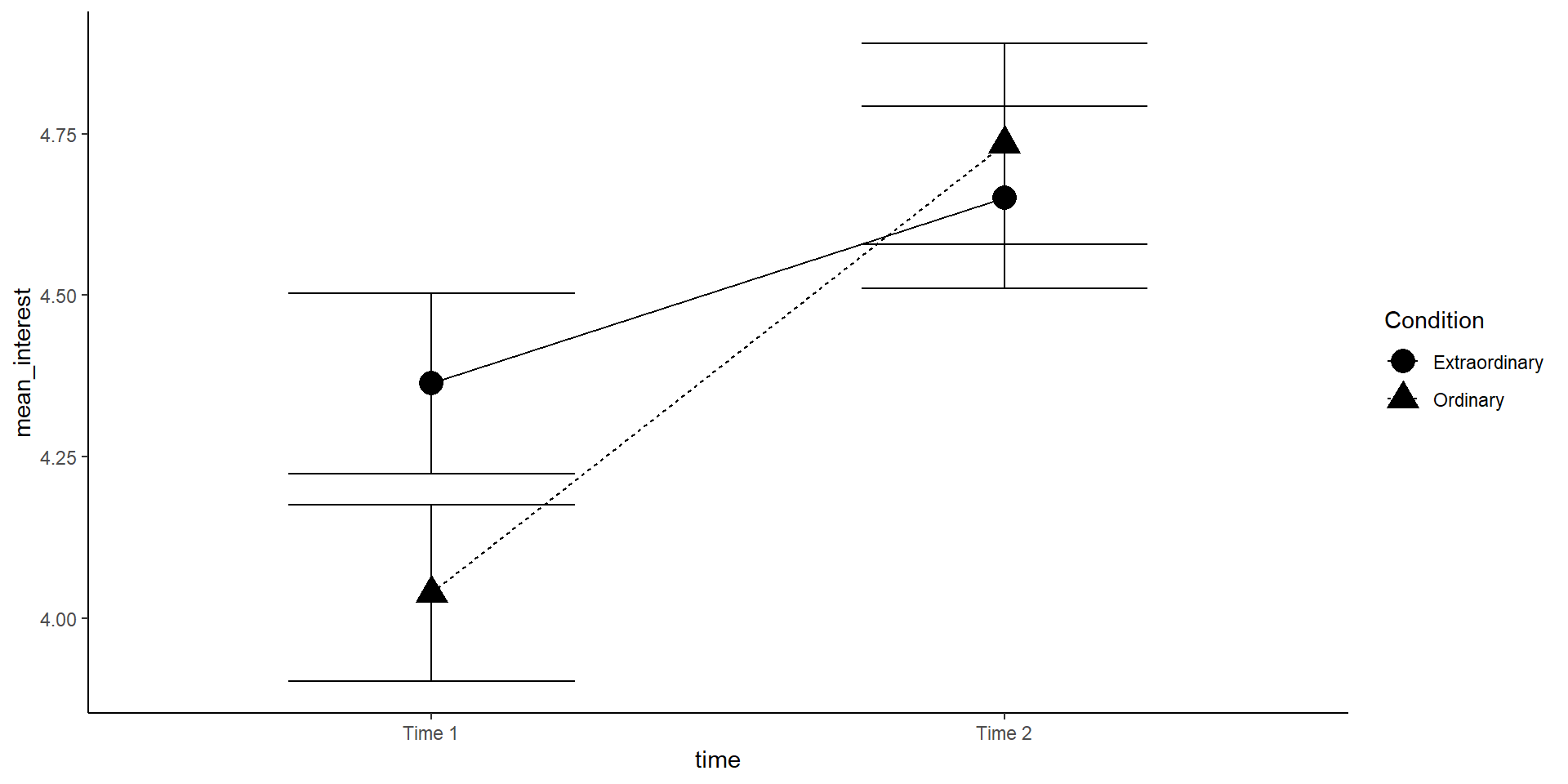
lineplot <- sum_dat_factorial %>%mutate(se_interest = sd_interest /sqrt(n)) %>%ggplot(aes(x = time, y = mean_interest, group = Condition, shape = Condition)) +geom_errorbar(aes(ymin = mean_interest - se_interest, ymax = mean_interest + se_interest), width=.5) +geom_point(size =5) +geom_line(aes(linetype = Condition)) +#scale_x_discrete(labels = c("Time 1", "Time 2")) + #this is how you could change x-axis labelstheme_classic()lineplot
The increase in interest between time 1 and 2 seems greater in the ordinary condition! But is this interaction effect significant?
Note: You may want to add position = position_dodge(.5) to all geoms to avoid an overlap of errorbars.
Note2: The (between-subject) errorbars are only helpful to interpret the significance of the between-subject effect Condition (at each time point). For the within-subject effect of time, we would need the mean and standard error of the paired differences (but this is very hard to visualize).
Mixed ANOVA
We now want to run a mixed ANOVA. It is called “mixed” because it includes both between- and within-subjects factors.
Complete the below code to run the factorial ANOVA. Remember that you will need to specify both IVs and that one of them is between-subjects and one of them is within-subjects. Look up the help documentation for aov_ez to find out how to do this.
Save the ANOVA model to an object called mod_factorial
Run the code and inspect the result. Now, try to pull out the ANOVA table only. You can either do this with mod_factorial$anova_table or anova(mod_factorial). Hint: You can use tidy() to save the output table as a data frame, which might be useful.
mod_factorial <-aov_ez(id ="NULL",data =NULL, between ="NULL", within ="NULL",dv ="NULL", type =3,es ="NULL") NULL%>%tidy()
mod_factorial <-aov_ez(id ="subject",data = zhang_data2, between ="Condition", within ="time",dv ="interest", type =3,es ="pes") anova(mod_factorial) %>%tidy() #or mod_factorial$anova_table %>% tidy()
Conclusion: The main effect of time and the interaction between time and Condition are significant. Judged by visual inspection of the plot, interest increases over time, especially for the “ordinary” group.
Assumption Checking
The assumptions for a factorial ANOVA are the same as the one-way ANOVA.
The DV is continuous (interval or ratio data)
The observations should be independent (only true for between-subjects variables!)
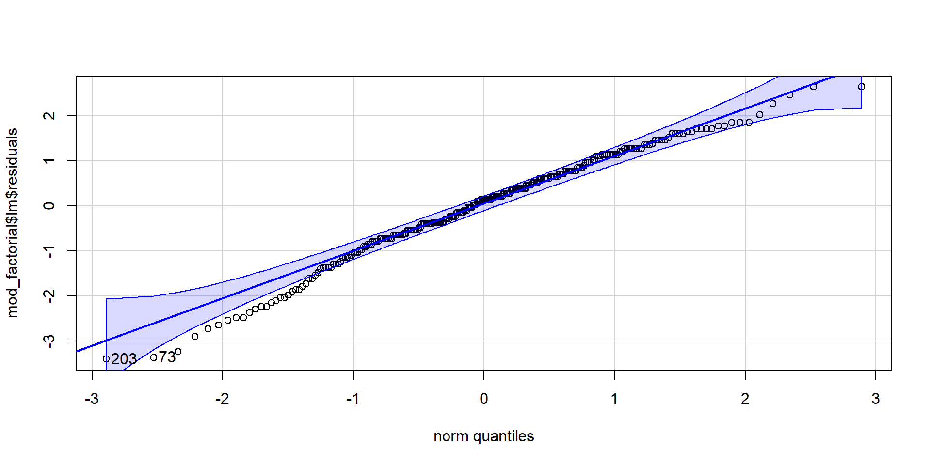
The residuals should be normally distributed
There should be homogeneity of variance between the groups
To test assumption 3, extract the residuals from the model, create a QQ-Plot and conduct a Shapiro-Wilk test. For assumption 4, we use the Levene test for homogeneity of variance.
OK: There is not clear evidence for different variances across groups (Levene's Test, p = 0.893).
Write Up
What do we need to report?
Summary statistics (means, SDs, N) per cell
F(df1, df2) = F-value, p = p-value, effect size per effect (apa package!)
A visualization of the most important effect(s) in the data
Possibly pairwise contrasts (or t-tests)
Interpretation (direction of effect and theoretical meaning)
Example how to use the apa package for reporting (you want print=F and :
We found a main effect of time (`r apa::anova_apa(mod_factorial, print=F, format="markdown") %>% filter(effect=="time") %>% pull(text)`) with interest increasing from the first time point (*M* = `r zhang_data2 %>% summarise(m = mean(interest, na.rm=TRUE), .by = c(time)) %>% filter(time %>% grepl("1", ., fixed=T)) %>% pull(m) %>% signif(3)`) to the second (*M* = `r zhang_data2 %>% summarise(m = mean(interest, na.rm=TRUE), .by = c(time)) %>% filter(time %>% grepl("1", ., fixed=T)) %>% pull(m) %>% signif(3)`). This effect was superseded by an interaction of time and condition (`r apa::anova_apa(mod_factorial, print=F, format="markdown") %>% filter(effect=="Condition:time") %>% pull(text)`) [...].
We found a main effect of time (F(1, 128) = 25.88, p < .001, petasq = .17) with interest increasing from the first time point (M = 4.2) to the second (M = 4.2). This effect was superseded by an interaction of time and condition (F(1, 128) = 4.44, p = .037, petasq = .03) […].
Hint: You can add gsub to insert the greek letter for eta: gsub("petasq", "$\\eta_p^2$", ., fixed=T)
We found a main effect of time (`r apa::anova_apa(mod_factorial, print=F, format="markdown") %>% filter(effect=="time") %>% pull(text) %>% gsub("petasq", "$\\eta_p^2$", ., fixed=T)`) [...]
We found a main effect of time (F(1, 128) = 25.88, p < .001, \(\eta_p^2\) = .17) […]
Regression/Linear Model
You can run a regression with two continuous variables, one IV and one DV (similar to correlations). Check out Chapter 16 on how to do that.
You can also have categorical IVs, which would make it similar to running an ANOVA.
But most importantly, the linear model is super flexible and you can combine continuous and categorical IVs or predictors! This is called multiple regression because you have several IVs.
In the paper, the authors investigated whether there is a “just right” amount of screen time that is associated with higher well-being.
In this huge dataset (\(N=120,000\)), we have the following variables that we will use for analysis:
a continuous DV, well-being (Warwick-Edinburgh Mental Well-Being Scale; WEMWBS). This is a 14-item scale with 5 response categories, summed together to form a single score ranging from 14-70 (so it’s not completely continuous…),
Load the CSV datasets into variables called pinfo, wellbeing, and screen using read_csv().
Take a look at the data and make sure you understand what you see.
The wellbeing tibble has information from the WEMWBS questionnaire,
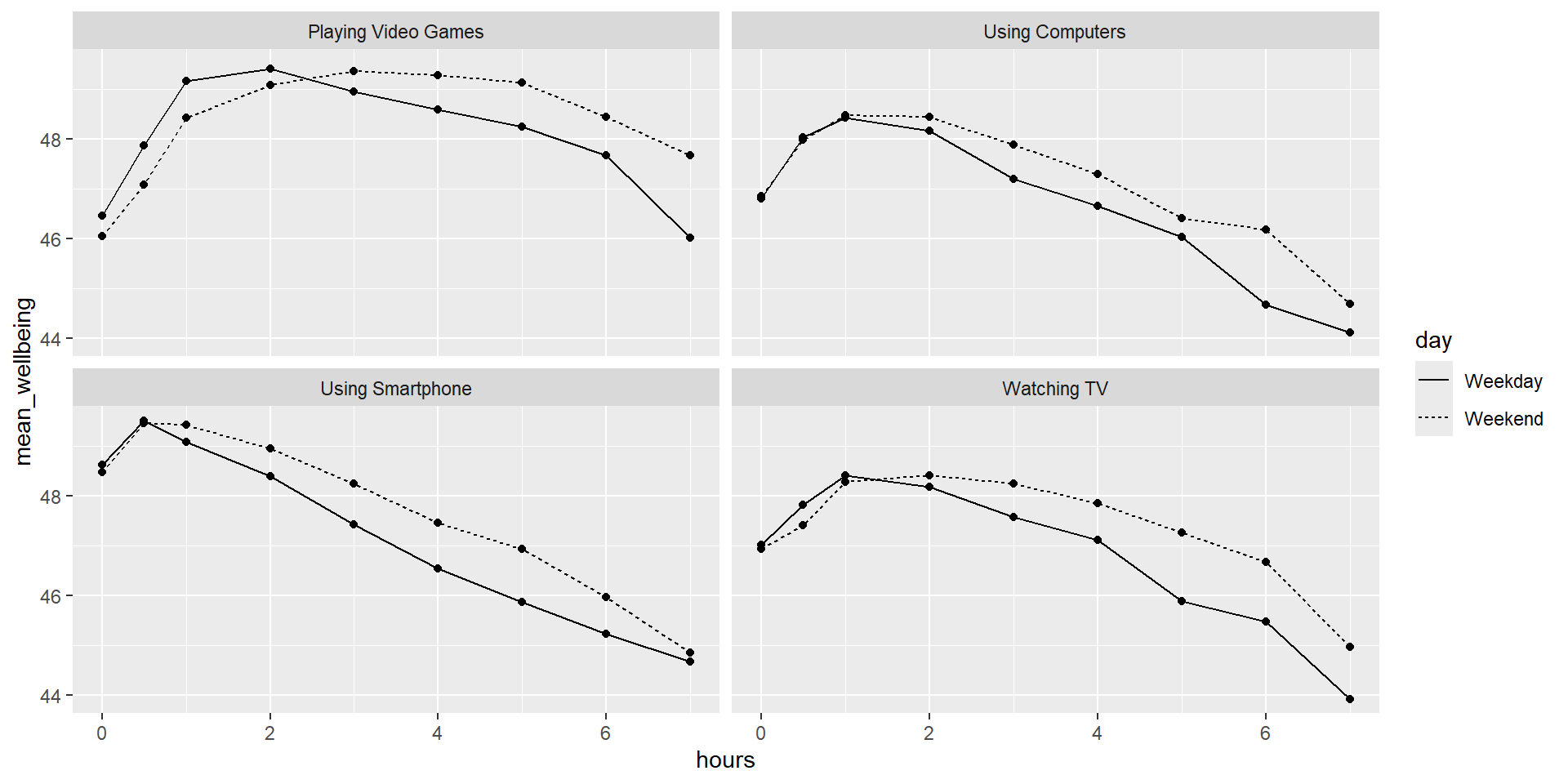
screen has information about screen time use on weekends (variables ending with “we”) and weekdays (variables ending with “wk”) for four types of activities:
using a computer (variables starting with “Comph”; Q10 on the survey)
playing video games (variables starting with “Comp”; Q9 on the survey)
using a smartphone (variables starting with “Smart”; Q11 on the survey), and
watching TV (variables starting with “Watch”; Q8 on the survey).
Preprocessing
Calculate the WEMWBS scores by taking the sum of all the items:
Write the code to create a new table called wemwbs with two variables: Serial (the participant ID), and tot_wellbeing, the total WEMWBS score.
you might have to “pivot” the data from wide to long format and use .by to calculate the well-being (WEMWBS) score per person.
verify for yourself that the scores all fall in the 14-70 range. Przybylski and Weinstein reported a mean of 47.52 with a standard deviation of 9.55. Can you reproduce these values?
wemwbs = wellbeing %>%pivot_longer(names_to ="var", values_to ="score", cols =-Serial) %>%summarise(tot_wellbeing =sum(score), .by=Serial)# you could also mutate(tot_wellbeing = WBOptimf + ...) # but it is easier to use "across" and "filter" the variable nameswemwbs = wellbeing %>%mutate(tot_wellbeing =rowSums(across(starts_with("WB")))) %>%select(Serial, tot_wellbeing)# sanity check valueswemwbs %>%summarise(mean =mean(tot_wellbeing),sd =sd(tot_wellbeing),min =min(tot_wellbeing), max =max(tot_wellbeing))
      mean       sd min max
1 47.52189 9.546374  14  70
Data Visualization
We now want to visualize the relationship between screen time (for the four different technologies) and well-being.
Run the code below and write comments in the code that explain what each line of code is doing:
Next, create a new tibble called smart_wb that only includes participants from smarttot who used a smartphone for more than one hour per day each week and then combine (join) this table with the information in wemwbs and pinfo.
When you do regression analysis, it is helpful to mean center your continuous (independent) variables. You mean center a predictor X simply by subtracting the mean (X_centered = X - mean(X)). This has two useful consequences:
the model intercept reflects the prediction for Y at the mean value of the predictor variable, rather than at the zero value of the original variable;
if there are interactions in the model, any lower-order effects can be given the same interpretation as they receive in ANOVA (main effects, rather than simple effects). (Don’t worry if you don’t understand what this means yet!)
If you mean-center categorical predictors with two levels, these become coded as \(-.5\) and \(.5\) (because the mean of these two values is 0). This is also handy and is called effects coding. (Not exactly true for unequal group sizes! So rather use if_else() function and assign \(-.5\) and \(.5\))
Tasks
Use mutate to add two new variables to smart_wb: tothours_c, calculated as a mean-centered version of the tothours predictor; and male_c, recoded as \(-.5\) for female and \(.5\) for male.
To create male_c you will need to use if_else(male == 1, .5, -.5)
(Read as: “If the variable male equals 1, switch it to \(.5\), if not, switch it to \(-.5\)”.)
Finally, recode male and male_c as factors, so that R knows not to treat them as real numbers.
smart_wb <- smarttot %>%filter(tothours >1) %>%inner_join(wemwbs, "Serial") %>%inner_join(pinfo, "Serial") %>%mutate(thours_c = tothours -mean(tothours),#thours_c = tothours %>% scale(), #alternative, also scales the variable to SD=1male_c =if_else(male ==1, .5, -.5) %>%as_factor(),male =as_factor(male))
Data Visualization 2
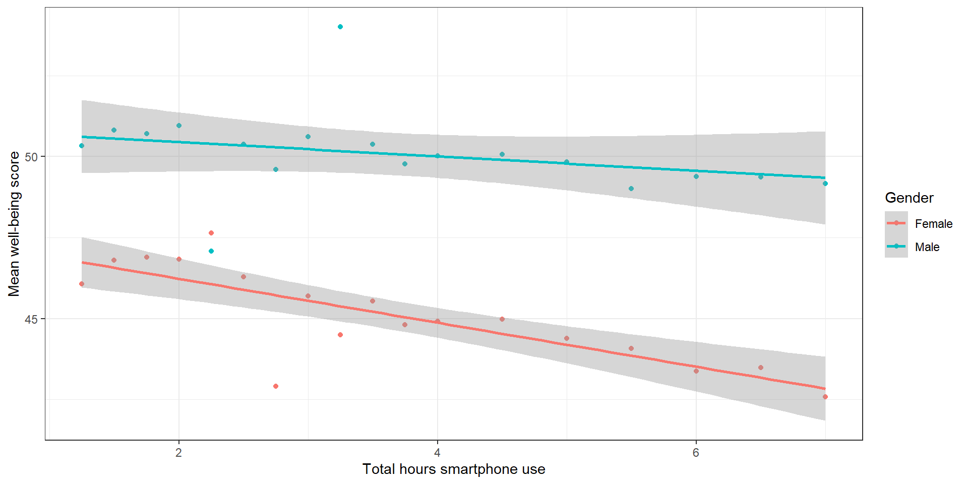
Try to recreate the following plot:
smart_wb_gen <- smart_wb %>%summarise(mean_wellbeing =mean(tot_wellbeing), .by=c(tothours, male))ggplot(NULL, aes(NULL, NULL, color =NULL)) +geom_NULL() +# which geom to use for the points?geom_NULL(method ="lm") +# which geom for the lines?scale_color_discrete(name ="Gender", labels =c("Female", "Male"))+scale_x_continuous(name ="Total hours smartphone use") +scale_y_continuous(name ="Mean well-being score") +theme_bw()
\(X1i\) is the mean-centered smartphone use variable for participant i;
\(X2i\) is gender (\(-.5\) = female, \(.5\) = male);
\(X3i\) is the interaction between smartphone use and gender (=\(X1i×X2i\))
mod <-lm(NULL~NULL, data = smart_wb)mod_summary <-summary(mod)
Analysis: Result
mod <-lm(tot_wellbeing ~ thours_c * male_c, data = smart_wb)#mod <- lm(tot_wellbeing ~ thours_c + male_c + thours_c:male_c, data = smart_wb)mod_summary <-summary(mod)mod_summary
Call:
lm(formula = tot_wellbeing ~ thours_c * male_c, data = smart_wb)

Residuals:
    Min      1Q  Median      3Q     Max
-36.881  -5.721   0.408   6.237  27.264

Coefficients:
                   Estimate Std. Error t value Pr(>|t|)
(Intercept)        44.86740    0.04478 1001.87   <2e-16 ***
thours_c           -0.77121    0.02340  -32.96   <2e-16 ***
male_c0.5           5.13968    0.07113   72.25   <2e-16 ***
thours_c:male_c0.5  0.45205    0.03693   12.24   <2e-16 ***
---
Signif. codes:  0 '***' 0.001 '**' 0.01 '*' 0.05 '.' 0.1 ' ' 1

Residual standard error: 9.135 on 71029 degrees of freedom
Multiple R-squared:  0.09381,   Adjusted R-squared:  0.09377
F-statistic:  2451 on 3 and 71029 DF,  p-value: < 2.2e-16
By which variable in the output is the interaction between smartphone use and gender shown? Is it significant?
How would you interpret the results?
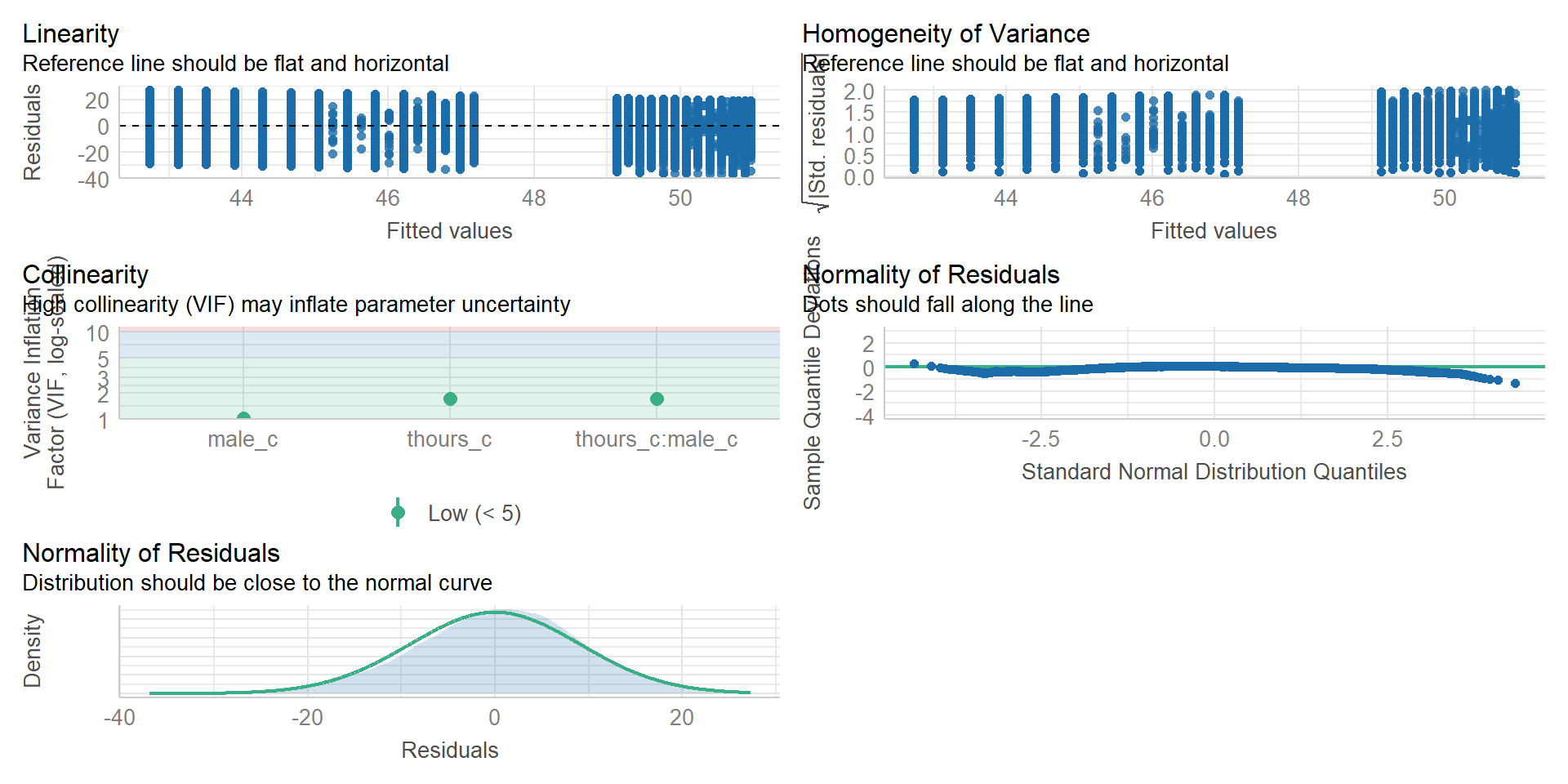
Assumption checking
Here are the assumptions for multiple regression:
The outcome/DV is continuous (interval/ratio level data)
The predictor variable is interval/ratio or categorical
All values of the outcome variable are independent (i.e., each score should come from a different participant)
The predictors have non-zero variance
The relationship between outcome and predictor is linear
The residuals should be normally distributed
There should be homoscedasticity (homogeneity of variance, but for the residuals)
Multicollinearity: predictor variables should not be too highly correlated
From the work we’ve done so far we know that assumptions 1 - 4 are met and we can use the functions from the performance package again to check the rest (this will take a while because the dataset is so huge)
(Note: the line in the homogeneity plot is missing due to the large amount of data. Check out the textbook for a solution as well as for further information on what these measures mean.)
Further Analysis of Interaction
We can use emmeans package to further investigate the direction of the interaction. This is especially handy if we have more than two factor levels and can’t read out the direction of the effect from the model summary.
Specifically, we’re using the emtrends() function, because we have a continuous variable and want to know the (simple) slope/trend of this variable within each of the factor levels of the categorical variable:
test(simple_slopes_interaction) # with the test() function, you can get the p-value to test whether the slope within each group is sign. different from 0!
For the write up, you can copy this text block, including inline code (wrapped by R) to directly use the output of R in your text. If you then knit your document, it will insert the values:
All continuous predictors were mean-centered and deviation coding was used for categorical predictors. The results of the regression indicated that the model significantly predicted course engagement (*F*(`r mod_summary$fstatistic[2]`, `r mod_summary$fstatistic[3] %>% round(2)`) = `r mod_summary$fstatistic[1] %>% round(2)`, *p* \< .001, adjusted *R*^2 = `r mod_summary$adj.r.squared %>% round(2)`, f^2^ = .63), accounting for `r (mod_summary$adj.r.squared %>% round(2))*100`% of the variance. Total screen time was a significant negative predictor of wellbeing scores (β = `r mod$coefficients[2] %>% round(2)`, *p* \< .001), as was gender (β = `r mod$coefficients[3] %>% round(2)`, *p* \< .001), with girls having lower wellbeing scores than boys. Importantly, there was a significant interaction between screentime and gender (β = `r mod$coefficients[4] %>% round(2)`, *p* \< .001): Smartphone use was more negatively associated with wellbeing for girls than for boys.
All continuous predictors were mean-centered and deviation coding was used for categorical predictors. The results of the regression indicated that the model significantly predicted course engagement (F(3, 7.1029^{4}) = 2450.89, p < .001, adjusted R^2 = 0.09, f2 = .63), accounting for 9% of the variance. Total screen time was a significant negative predictor of wellbeing scores (β = -0.77, p < .001), as was gender (β = 5.14, p < .001), with girls having lower wellbeing scores than boys. Importantly, there was a significant interaction between screentime and gender (β = 0.45, p < .001): Smartphone use was more negatively associated with wellbeing for girls than for boys.
Write Up 2
You can also use the report() function from the report package to get a suggestion for what to report from your results (it would still need some editing!):
report(mod)
We fitted a linear model (estimated using OLS) to predict tot_wellbeing with
thours_c and male_c (formula: tot_wellbeing ~ thours_c * male_c). The model
explains a statistically significant and weak proportion of variance (R2 =
0.09, F(3, 71029) = 2450.89, p < .001, adj. R2 = 0.09). The model's intercept,
corresponding to thours_c = 0 and male_c = -0.5, is at 44.87 (95% CI [44.78,
44.96], t(71029) = 1001.87, p < .001). Within this model:

  - The effect of thours c is statistically significant and negative (beta =
-0.77, 95% CI [-0.82, -0.73], t(71029) = -32.96, p < .001; Std. beta = -0.15,
95% CI [-0.16, -0.15])
  - The effect of male c [0.5] is statistically significant and positive (beta =
5.14, 95% CI [5.00, 5.28], t(71029) = 72.25, p < .001; Std. beta = 0.54, 95% CI
[0.52, 0.55])
  - The effect of thours c × male c [0.5] is statistically significant and
positive (beta = 0.45, 95% CI [0.38, 0.52], t(71029) = 12.24, p < .001; Std.
beta = 0.09, 95% CI [0.08, 0.11])

Standardized parameters were obtained by fitting the model on a standardized
version of the dataset. 95% Confidence Intervals (CIs) and p-values were
computed using a Wald t-distribution approximation.