1.3 Data Visualization
Dr. Mario Reutter & Juli Nagel
(slides adapted from Dr. Lea Hildebrandt)
ggplot
We will use a package called ggplot2 (part of the tidyverse). ggplot2 is a very versatile package that allows us to make beautiful, publication-ready(-ish) figures.
ggplot2 follows the “grammar of graphics” by Leland Wilkinson, a formal guide to visualization principles. A core feature are the layers each plot consists of. The main function to “start” plotting is ggplot() - we will then add layers of data and layers to tweak the appearance.
Layers of a ggplot
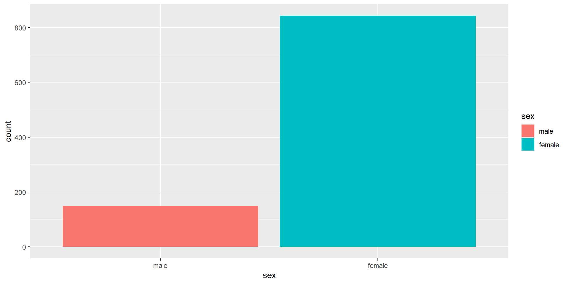
The First Layer
The first line (or layer) sets up the base of the graph: the data to use and the aesthetics (
aes()) (what will go on the x and y axis, how the plot will be grouped).aes()includes anything that is directly related to your data: e.g., what goes on the x and y axis, or whether the plot should be grouped by a variable in your data.We can provide
xandyas arguments, however, in a bar plot, the count per category is calculated automatically, so we don’t need to put anything on the y-axis ourselves.
The Second Layer
The next layer adds a geom or a shape. In this case we use geom_bar() as we want to draw a bar plot.
- Note that we are adding layers, using a
+between layers. This is a very important difference between pipes and visualization.
The Second Layer with color
Adding
fillto the first layer will separate the data into each level of the grouping variable and fill it with a different color. Note thatfillcolors the inside of the bar, whilecolourcolors the bar’s outlines.We can get rid of the (in this case redundant legend) with
show.legend = FALSE.
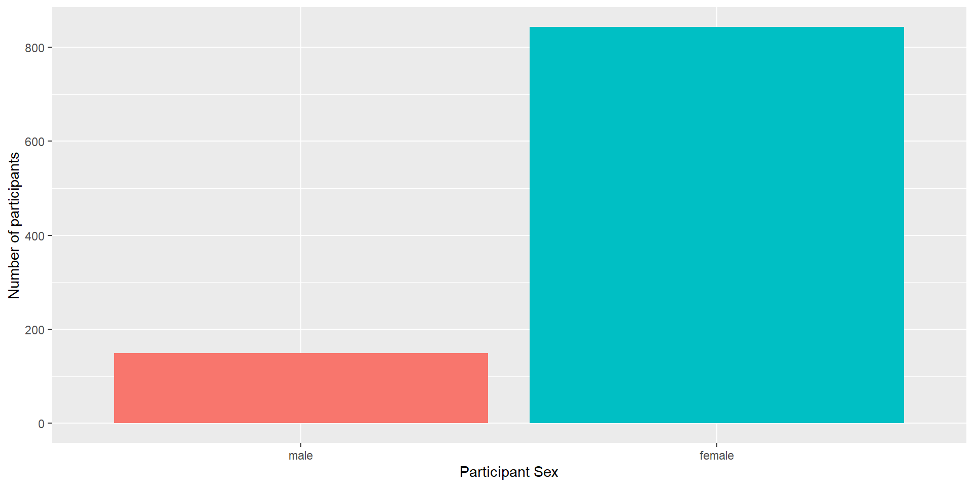
The Next Layers - Improving the Plot
We might want to make the plot a bit prettier and easier to read. What would you improve?
We could add better axis labels, and custom colors. We can do so with the functions scale_x_discrete() and scale_y_continuous(), which adjust the x and y axes.
Both functions can change several aspects of our axes; here, we use the argument name to set a new axis name.
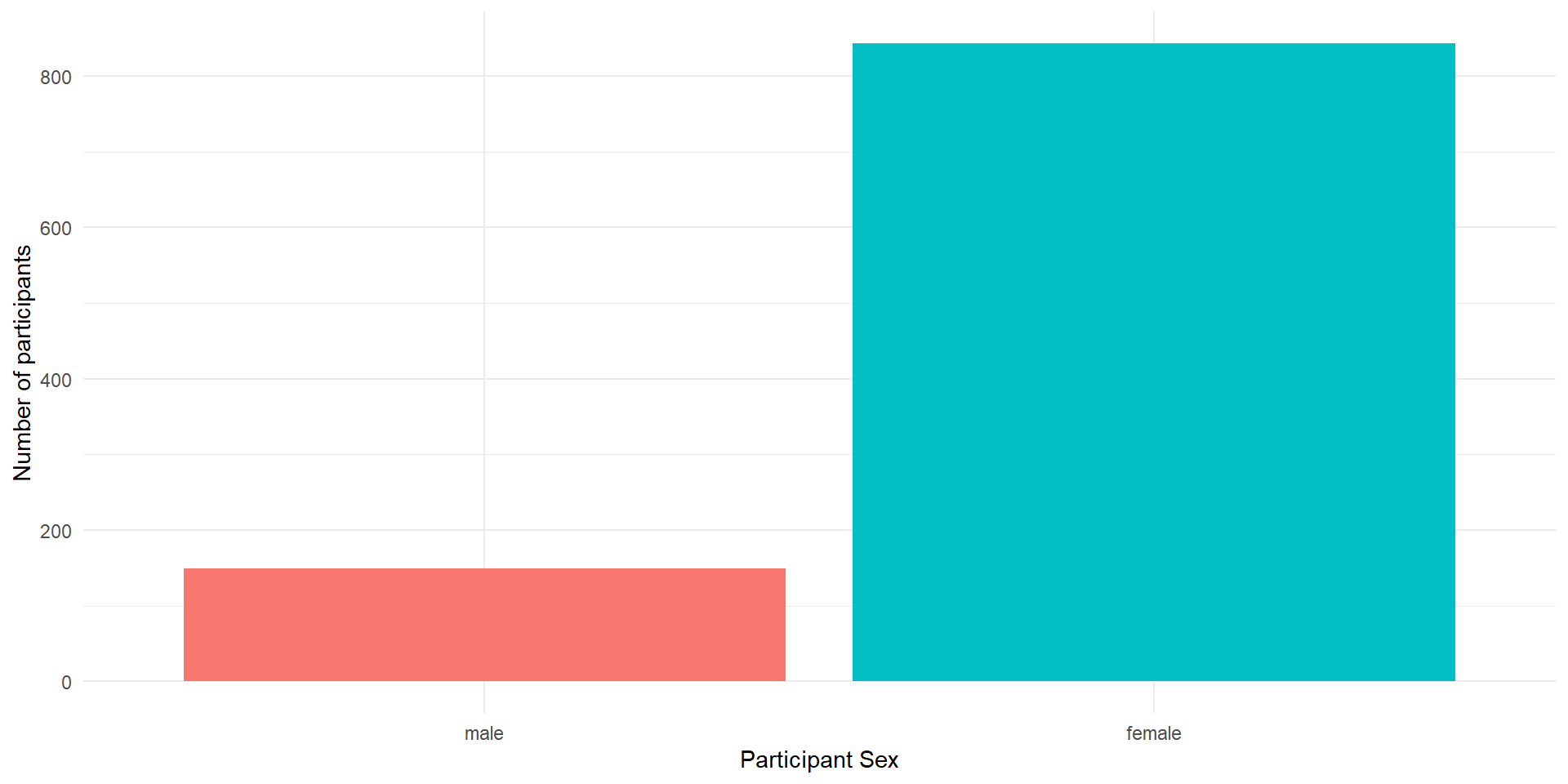
Themes: Changing the Appearance
There are a number of built-in themes that you can use to change the appearance (background, whether axes are shown etc.), but you can also tweak the themes further manually.
We will now change the default theme to theme_minimal(), but you can also try other themes (just type “theme_” and see what the autocomplete brings up).
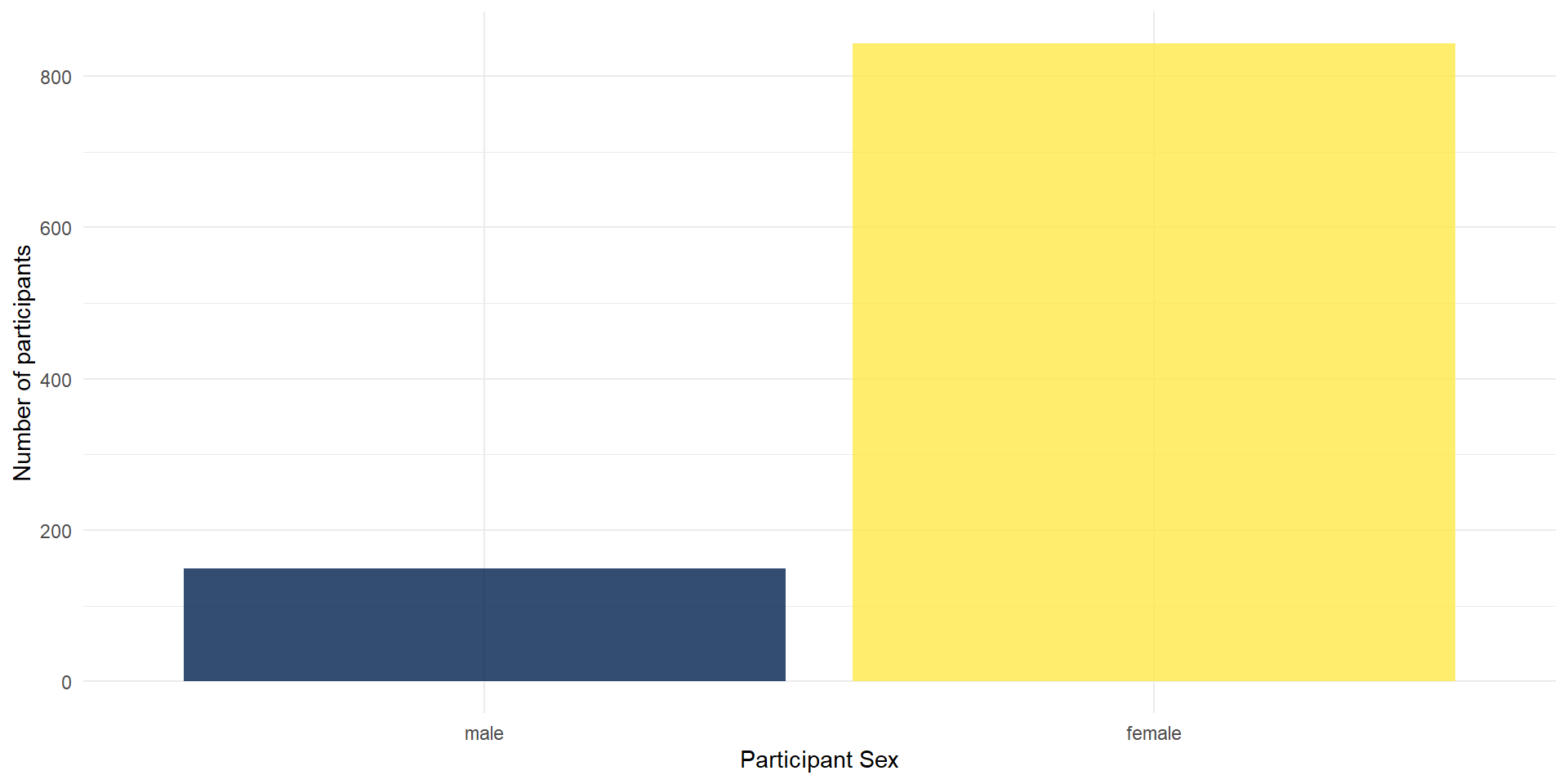
Colors
There are various ways to change the colors of the bars. You can manually indicate the colors you want to use but you can also easily use pre-determined color palettes that are already checked for color-blind friendliness.
A popular palette is viridis. We can simply add a function/layer to your ggplot named scale_fill_viridis_d() (d for discrete). The function has an option parameter that takes 5 different values (A - E).
- Run the code below. Try changing the option to either A, B, C or D and see which one you like!

Transparency
You can also add transparency to your plot, which can be helpful if you plot several layers of data that overlap.
To do so, you can simply add alpha to the geom_bar() - try changing the value of alpha (between 0 and 1):
Grouped Plots
Imagine that you have several factors that you want to use to group your data, such as gender and income. In this case, you could use a grouped bar plot:
ggplot(summarydata2, aes(x = sex, fill = income)) +
geom_bar(
# the default are stacked bars; we use "dodge" to put them side by side
position = "dodge",
alpha = .8
) +
scale_x_discrete(name = "Participant Sex") +
scale_y_continuous(name = "Number of participants") +
theme_minimal() +
scale_fill_viridis_d(option = "E")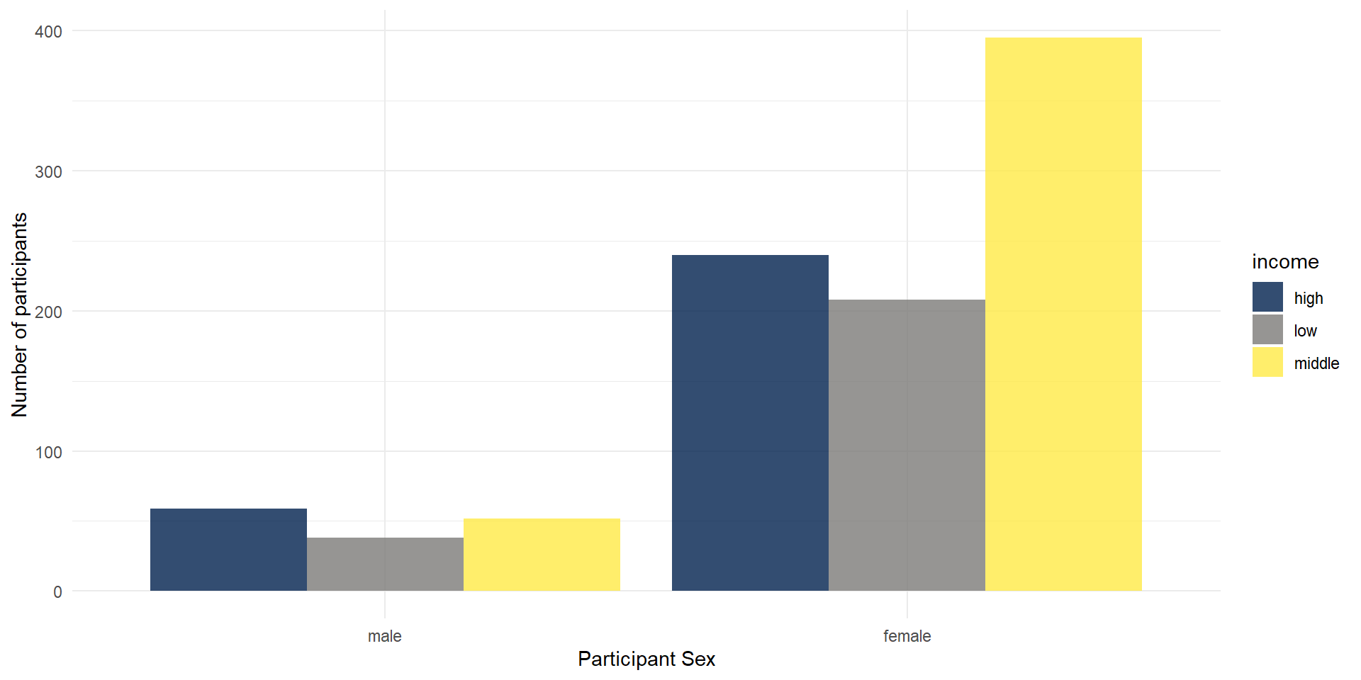
Facetting
You could also use facets to divide your data visualizations into several subplots: facet_wrap for one variable.
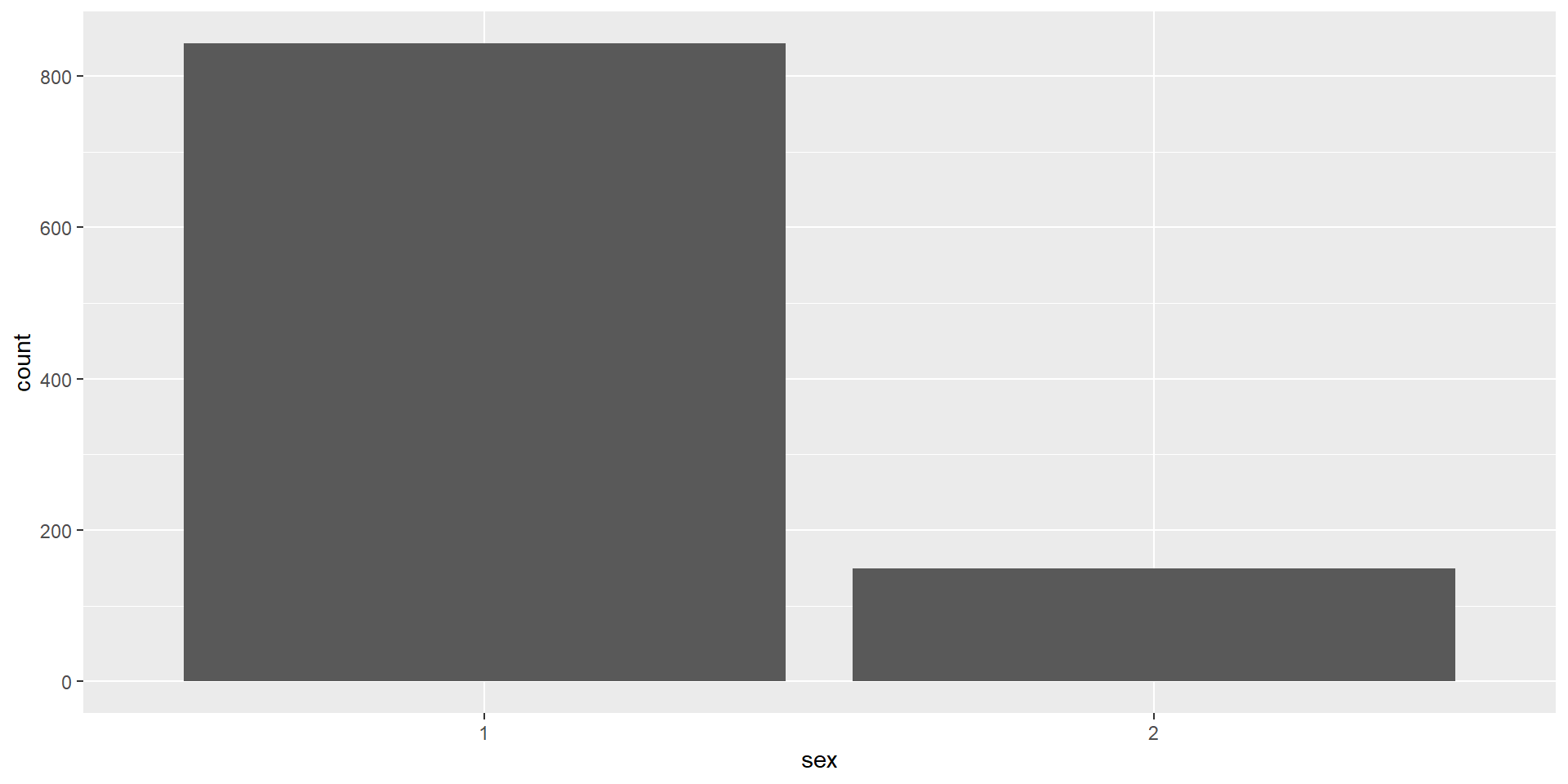
ggplot(summarydata2, aes(x = sex, fill = sex)) +
  geom_bar(show.legend = FALSE,
           alpha = .8) +
  scale_x_discrete(name = "Participant Sex") +
  scale_y_continuous(name = "Number of participants") +
  theme_minimal() +
scale_fill_viridis_d(option = "E") +
facet_wrap(vars(income)) # here, you need to use vars() around variable names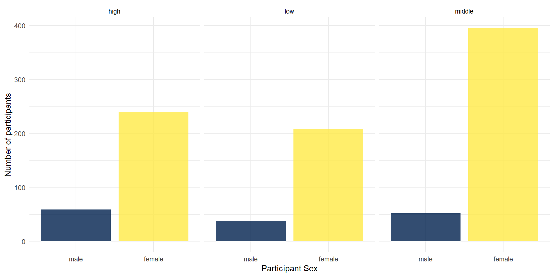
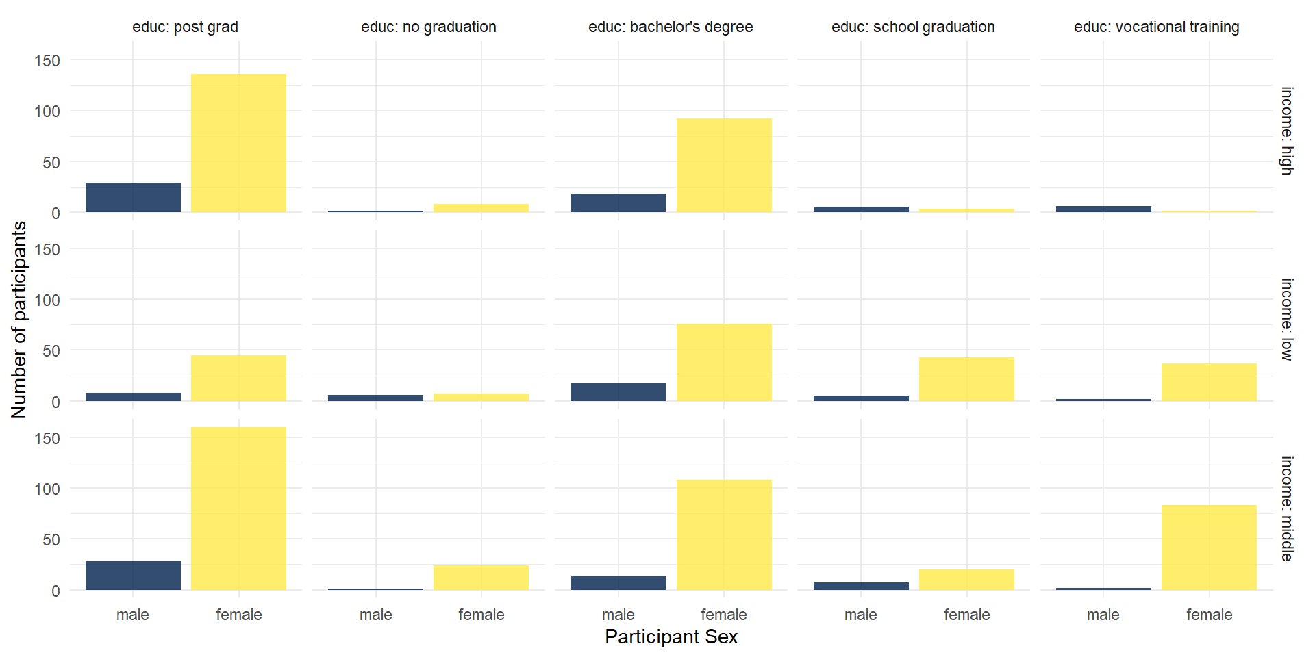
Facetting 2
You could also use facets to divide your data visualizations into several subplots: facet_grid for a matrix of (combinations of) two variables.
ggplot(summarydata2, aes(x = sex, fill = sex)) +
  geom_bar(show.legend = FALSE, alpha = .8) +
  scale_x_discrete(name = "Participant Sex") +
  scale_y_continuous(name = "Number of participants") +
  theme_minimal() +
  scale_fill_viridis_d(option = "E")  +
  facet_grid(
    rows = vars(income),
    cols = vars(educ),
    labeller = "label_both" # this adds the variable name into the facet legends
  )
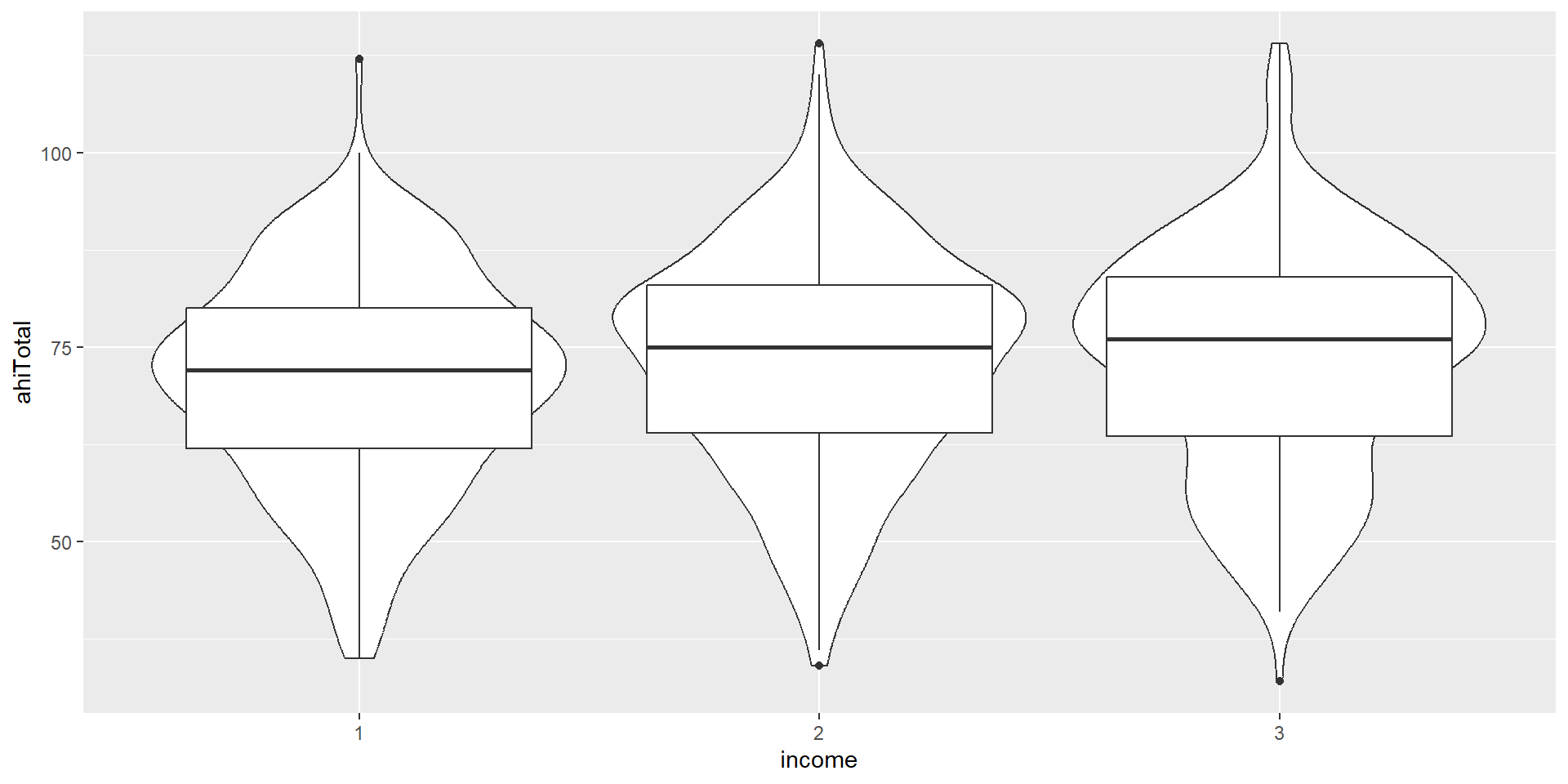
A closer look

Violin-Boxplot
Let’s look at the code. How does the code differ from the one for the barplot above?
ggplot(summarydata1, aes(x = income,
                         y = ahiTotal, # new variable!
                         fill = income)) +
  geom_violin(trim = FALSE, # smooth on edges
              alpha = .4) +
  geom_boxplot(width = .2, # small boxplot contained in violin
               alpha = .7) +
  scale_x_discrete(
    name = "Income",
    # set new labels
    labels = c("Below Average", "Average", "Above Average")) +
  scale_y_continuous(name = "Authentic Happiness Inventory Score")+
  theme_minimal() +
  # no need to switch of axis for every geom individually
  theme(legend.position = "none") +
  scale_fill_viridis_d()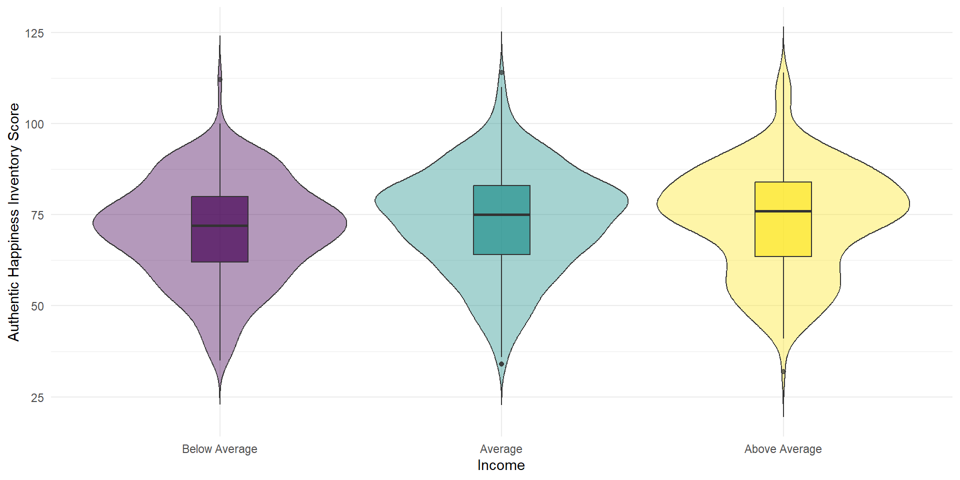
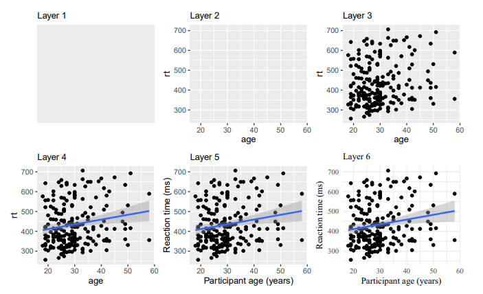
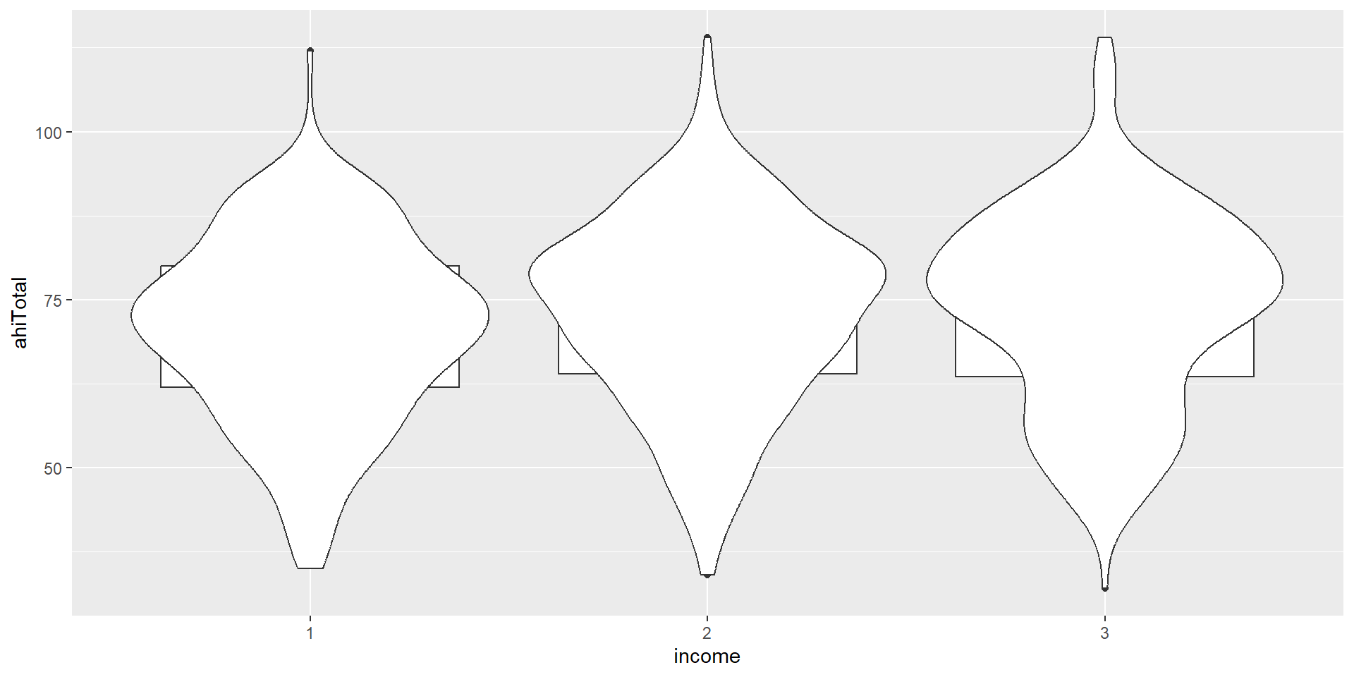
Layer Order
The order of layers is crucial, as the plot will be built up in that order (later layers on top):
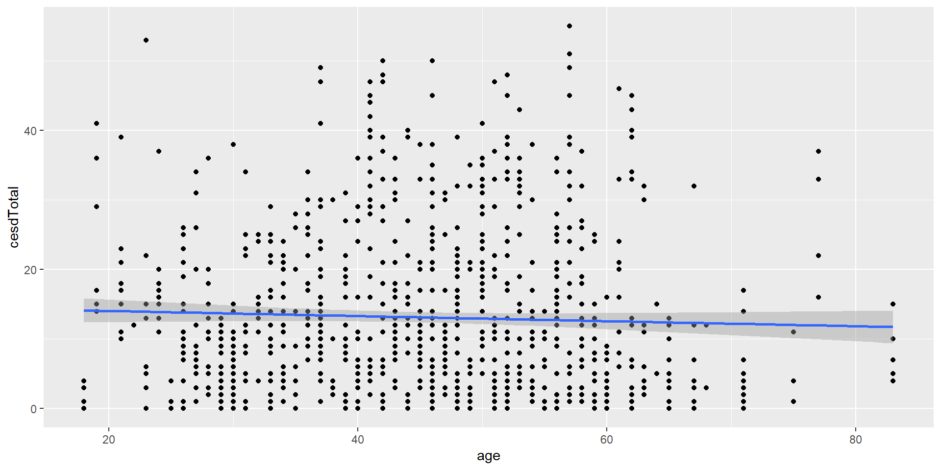
Scatterplot
If we have continuous data of two variables, we often want to make a scatter plot: