2.3 Visualizing Uncertainty
Workshop: “Handling Uncertainty in your Data”
Visualizing CIs
In the previous part, you learned about CIs around means and effect sizes.
CIs around means are for Figures.
CIs around effect sizes are for the statistical reporting section.
Visualizing CIs around means
In this part, we will visualize CIs around means for:
t-tests (one sample, independent samples, & paired samples),
ANOVAs (a simple 2x2 interaction),
and correlations.
You have already learned how to calculate CIs around their effect sizes (Cohen’s d, \(\eta_p^2\), and Pearson’s r)
GgThemes
The default options in ggplot have some problems: Most importantly, text is too small. The easiest solution is to create your own theme that you apply to your plots.
I am currently using this theme adapted from an old script of Lara Rösler.
theme_set( # theme_set has to be executed every session; cf. library(tidyverse)
myGgTheme <- # you can save your theme in a local variable instead, add it to every plot, and save your environment across sessions
theme_bw() + # start with the black-and-white theme
theme(
#aspect.ratio = 1,
plot.title = element_text(hjust = 0.5),
panel.background = element_rect(fill = "white", color = "white"),
legend.background = element_rect(fill = "white", color = "grey"),
legend.key = element_rect(fill = "white"),
strip.background = element_rect(fill = "white"),
axis.ticks.x = element_line(color = "black"),
axis.line.x = element_line(color = "black"),
axis.line.y = element_line(color = "black"),
axis.text = element_text(color = "black"),
axis.text.x = element_text(size = 16, color = "black"),
axis.text.y = element_text(size = 16, color = "black"),
axis.title = element_text(size = 16, color = "black"),
legend.text = element_text(size = 14, color = "black"),
legend.title = element_text(size = 14, color = "black"),
strip.text = element_text(size = 12, color = "black"))
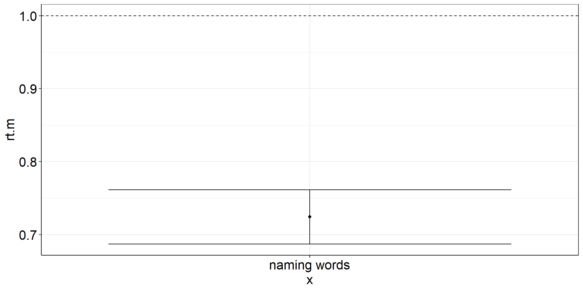
)One Sample t-test
Are the mean reaction times for naming words faster than 1 sec?
One Sample t-test: Visualization Code
ostt <-
  fhch2010_summary_wordnaming %>%
  summarize(
    rt.m = mean(rt), #careful! if you do rt = mean(rt), you cannot calculate ci_mean(rt) afterwards
    rt.m.low = confintr::ci_mean(rt)$interval[[1]], #not tidyverse-friendly :/
    rt.m.high = confintr::ci_mean(rt)$interval[[2]]) %>%

  ggplot(aes(y = rt.m, x = "naming words")) +
  geom_point() + #plot the mean
  geom_errorbar(aes(ymin = rt.m.low, ymax = rt.m.high)) + #plot the CI
geom_hline(yintercept = 1, linetype = "dashed") #plot the population mean to test againstOne Sample t-test: Figure
One Sample t-test - using a t.test()
Possible to use t.test() instead of confintr::ci_mean()!
ostt2 <-
  fhch2010_summary_wordnaming %>%
  summarize(
    rt.m = mean(rt),
    rt.m.low = t.test(rt)$conf.int[1], # also not tidy
    rt.m.high = t.test(rt)$conf.int[2]) %>%

  ggplot(aes(y = rt.m, x = "naming words")) +
  geom_point() +
  geom_errorbar(aes(ymin = rt.m.low, ymax = rt.m.high)) +
  geom_hline(yintercept = 1, linetype = "dashed")
Independent Samples t-test
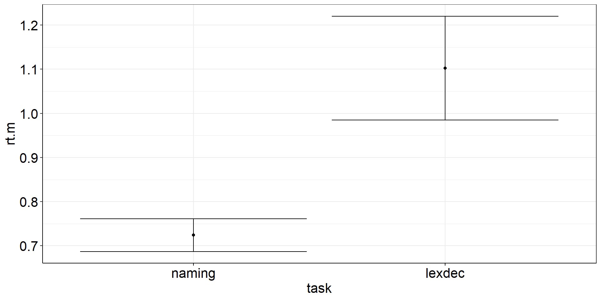
Are the mean reaction times for naming words different from lexically identifying words?
fhch2010_summary_words <-
  fhch2010_summary %>%
  filter(stimulus == "word")

with(fhch2010_summary_words,
     t.test(rt ~ task) #Welch test
     #t.test(rt ~ task, var.equal = TRUE) #assume equal variances
) #%>% apa::t_apa(es_ci = TRUE) #does not work for Welch test :(
    Welch Two Sample t-test

data:  rt by task
t = -6.351, df = 28.554, p-value = 6.55e-07
alternative hypothesis: true difference in means between group naming and group lexdec is not equal to 0
95 percent confidence interval:
 -0.5003253 -0.2564522
sample estimates:
mean in group naming mean in group lexdec
0.7241744 1.1025631 Independent Samples t-test: Viz Code?
istt <-
  fhch2010_summary_words %>%
  summarize(
    .by = task, #for more complex summaries, I like to put the .by argument first
    rt.m = mean(rt), #careful! if you do rt = mean(rt), you cannot calculate ci_mean(rt) afterwards
    rt.m.low = confintr::ci_mean(rt)$interval[[1]], #not tidyverse-friendly :/
    rt.m.high = confintr::ci_mean(rt)$interval[[2]]) %>%

  ggplot(aes(y = rt.m, x = task)) +
  geom_point() + #plot the means
  geom_errorbar(aes(ymin = rt.m.low, ymax = rt.m.high)) #plot the CIs
Independent Samples t-test: Figure?
CIs: comparing groups
Remember: confintr::ci_mean is for obtaining CIs to test a single mean against a fixed (errorless) number (most often 0).
⇒ Use confintr::ci_mean_diff to get the CI that accounts for the uncertainty in both means.
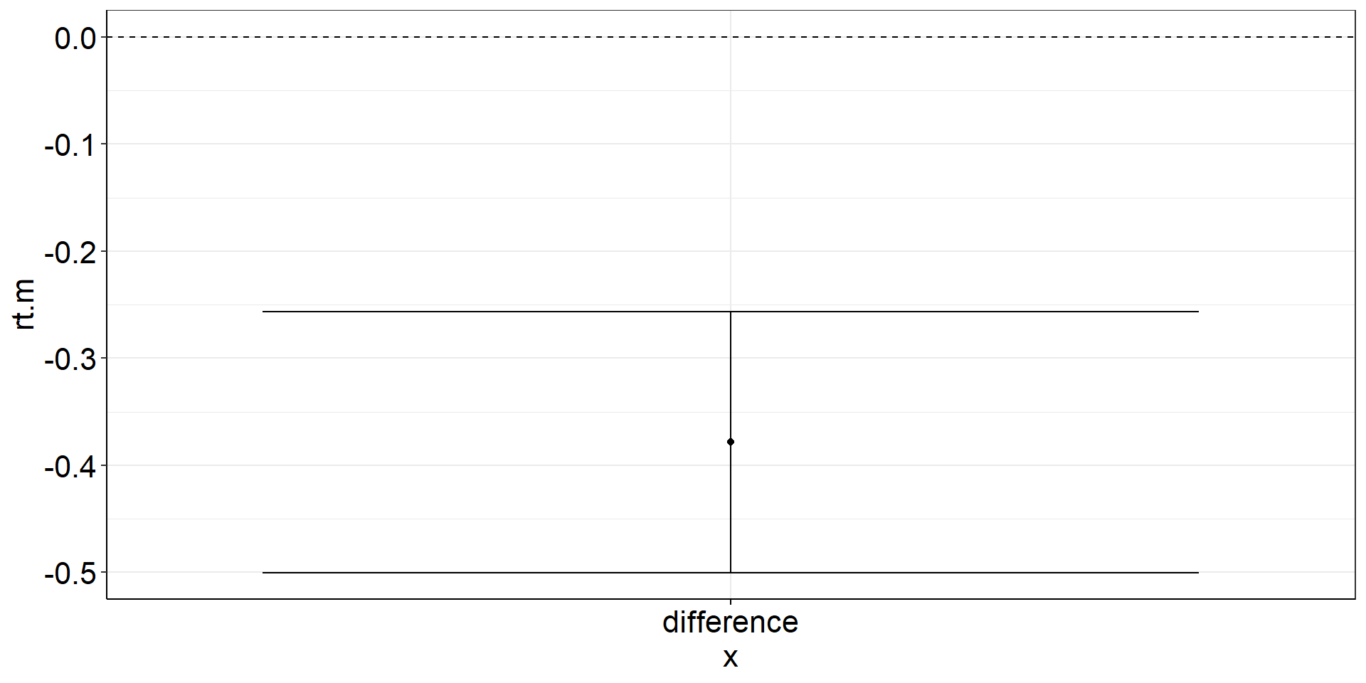
Independent Samples t-test: CI of the difference
Independent Samples t-test: CI of the difference: Viz Code
istt2 <-
  fhch2010_summary_words %>%
  pivot_wider(names_from = task, values_from = rt) %>%
  summarize(
    rt.m = mean(naming, na.rm = TRUE) - mean(lexdec, na.rm = TRUE), #difference of the means == mean difference
    rt.m.low = confintr::ci_mean_diff(naming, lexdec)$interval[[1]], #not tidyverse-friendly :/
    rt.m.high = confintr::ci_mean_diff(naming, lexdec)$interval[[2]]) %>%

  ggplot(aes(y = rt.m, x = "difference")) +
  geom_point() + #plot the mean difference
  geom_errorbar(aes(ymin = rt.m.low, ymax = rt.m.high)) + #plot the difference CI
  geom_hline(yintercept = 0, linetype = "dashed") #plot the population mean to test against
Independent Samples t-test: CI of the difference: Figure
Independent Samples t-test: using t.test()
istt3 <-
  fhch2010_summary_words %>%
  pivot_wider(names_from = task, values_from = rt) %>%
  summarize(
    rt.m = mean(naming, na.rm = TRUE) - mean(lexdec, na.rm = TRUE),
    rt.m.low = t.test(naming, lexdec)$conf.int[1], # also not tidy
    rt.m.high = t.test(naming, lexdec)$conf.int[2]) %>%

  ggplot(aes(y = rt.m, x = "difference")) +
  geom_point() +
  geom_errorbar(aes(ymin = rt.m.low, ymax = rt.m.high)) +
  geom_hline(yintercept = 0, linetype = "dashed")
Paired Samples t-test
Are the mean reaction times for naming words different from naming non-words?
fhch2010_summary_naming <-
  fhch2010_summary %>%
  filter(task == "naming")

# with(fhch2010_summary_naming, t.test(rt ~ stimulus, paired = TRUE)) #not allowed anymore :(
# fhch2010_summary_naming %>% rstatix::t_test(rt ~ stimulus, paired = TRUE, detailed = TRUE) # alternative!

with(fhch2010_summary_naming %>%
       pivot_wider(names_from = stimulus, values_from = rt, id_cols = id), #make pairing by id explicit
     t.test(word, nonword, paired = TRUE)) %>%
  apa::t_apa(es_ci = TRUE) # output to APA format
t(19) = -12.87, p < .001, d = -2.88 [-3.88; -1.86]Paired Samples t-test: Viz Code?
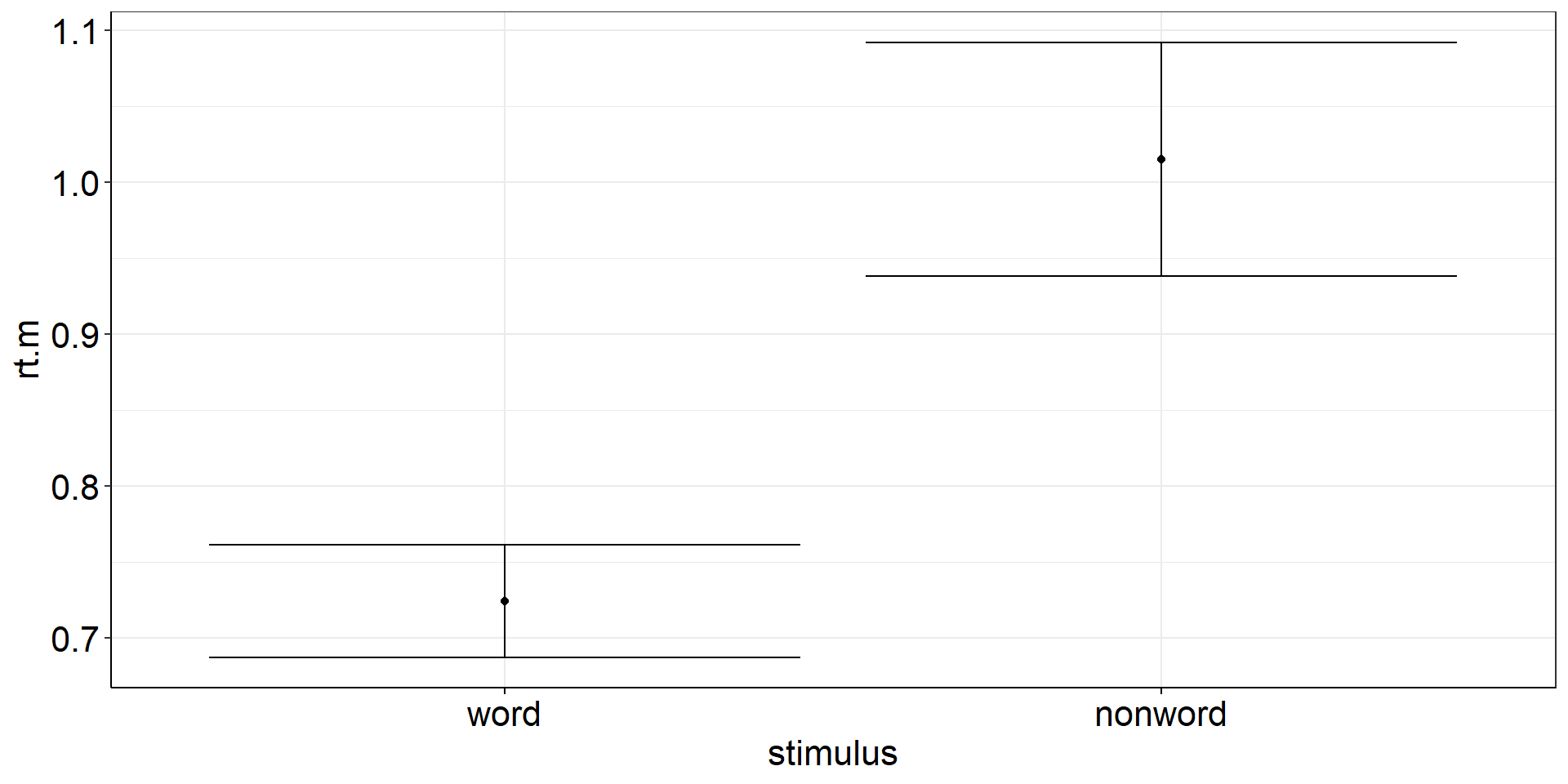
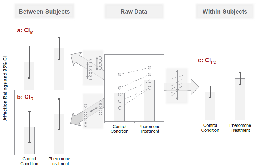
There is a difference between the precision of the means (aggregated across subjects) and the
precision of the paired differences (paired within the same subjects and then aggregated across).
Between- vs. Within-Subject Error
Remember this plot? Between- and within-subject variance can be (partially) independent.
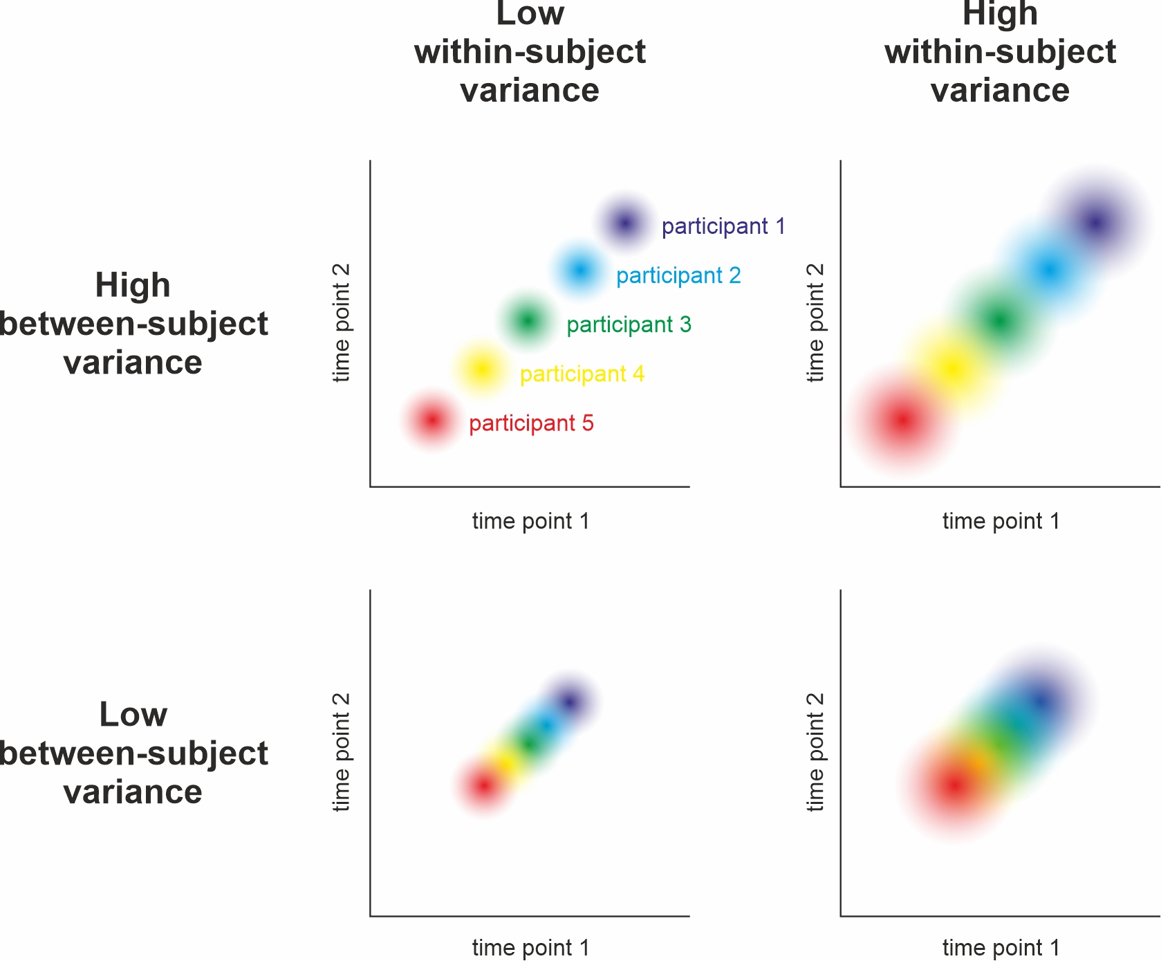
cf. Nebe, Reutter, et al. (2023); Fig. 2
Detour: Dependency of Between- & Within-Subject Errors
Between-subject variance does not affect within-subject variance but
within-subject variance increases the estimate of between-subject variance (Baker et al., 2021, Fig. 1)
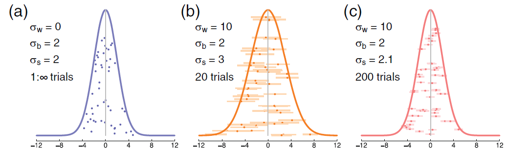
Kinds of Error Variance in paired samples
Pfister & Janczyk (2013), Fig. 1
Paired Samples t-test: Insight
The paired samples t-test of two factor levels
with(fhch2010_summary_naming %>%
       pivot_wider(names_from = stimulus, values_from = rt, id_cols = id), #make pairing by id explicit
     t.test(word, nonword, paired = TRUE)) %>%
  apa::t_apa(es_ci = TRUE) # output to APA format
t(19) = -12.87, p < .001, d = -2.88 [-3.88; -1.86]… is the one sample t-test of the paired differences (i.e., slopes between the factor levels).
with(fhch2010_summary_naming %>%
       pivot_wider(names_from = stimulus, values_from = rt, id_cols = id) %>%  #make pairing by id explicit
       mutate(diff = word - nonword),
     t.test(diff)) %>% # one sample t-test of paired differences
  apa::t_apa(es_ci = TRUE) # output to APA format
t(19) = -12.87, p < .001, d = -2.88 [-3.88; -1.86]Paired Samples t-test: Viz Code
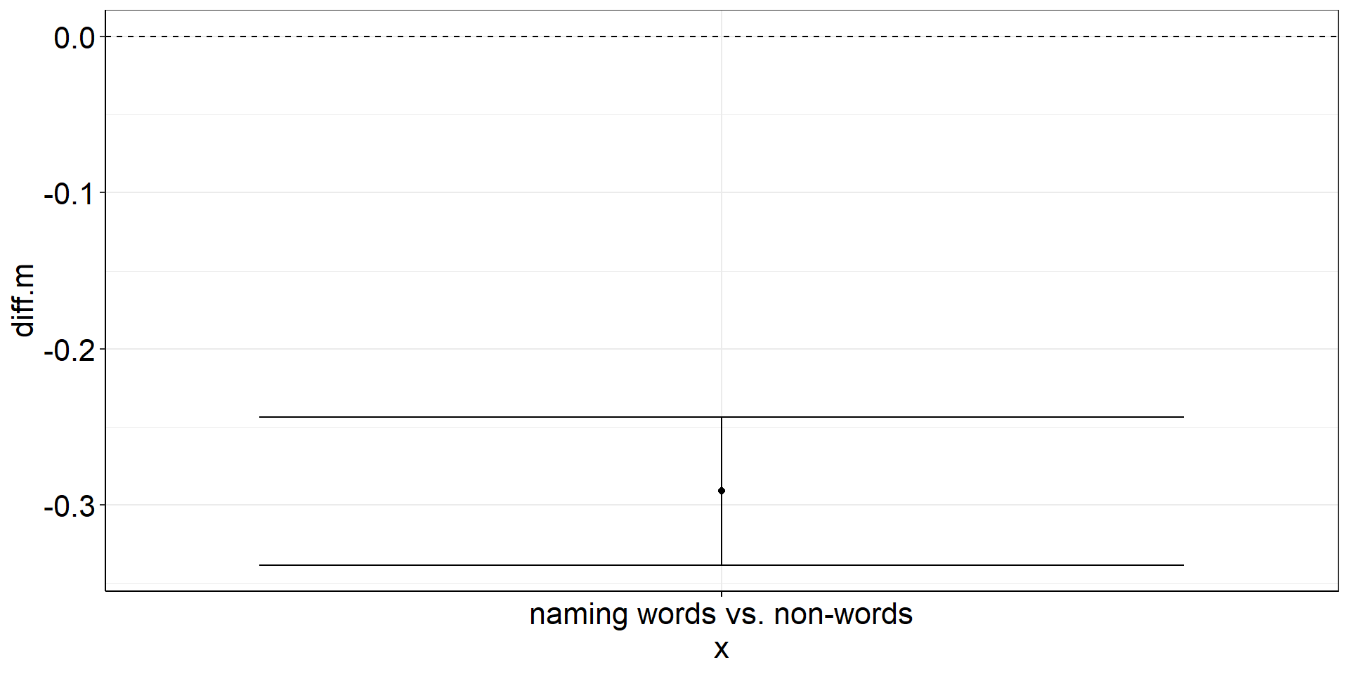
pstt <-
  fhch2010_summary_naming %>%
  pivot_wider(names_from = stimulus, values_from = rt, id_cols = id) %>%  #make pairing by id explicit
  mutate(diff = word - nonword) %>%
  #almost identical to one sample t-test from here
  summarize(diff.m = mean(diff),
            diff.m.low = confintr::ci_mean(diff)$interval[[1]],
            diff.m.high = confintr::ci_mean(diff)$interval[[2]]) %>%

  ggplot(aes(y = diff.m, x = "naming words vs. non-words")) +
  geom_point() + #plot the mean
  geom_errorbar(aes(ymin = diff.m.low, ymax = diff.m.high)) + #plot the CI
  geom_hline(yintercept = 0, linetype = "dashed") #plot the population mean to test against
Paired Samples t-test: Figure
ANOVA
Is the reaction time difference between words and non-words different for naming vs. lexical decision?
aov_words <-
  afex::aov_ez(
    id = "id",
    dv = "rt",
    data = fhch2010_summary,
    between = "task",
    within = "stimulus",
    # we want to report partial eta² ("pes"), and include the intercept in the output table ...
    anova_table = list(es = "pes", intercept = TRUE))

aov_words %>% apa::anova_apa() #optional: slightly different (APA-conform) output
Effect
1 (Intercept) F(1, 43) = 904.33, p < .001, petasq = .95 ***
2 task F(1, 43) = 15.76, p < .001, petasq = .27 ***
3 stimulus F(1, 43) = 77.24, p < .001, petasq = .64 ***
4 task:stimulus F(1, 43) = 31.89, p < .001, petasq = .43 ***ANOVA interaction: Viz Code 1
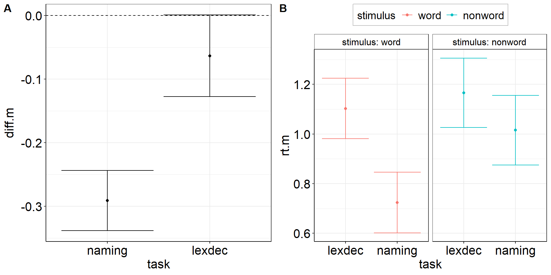
Within-effect modulated by between-variable:
Is the reaction time difference between words and non-words different for naming vs. lexical decision?
aov1 <-
  fhch2010_summary %>%
  pivot_wider(names_from = "stimulus", values_from = "rt", id_cols = c(id, task)) %>%
  mutate(diff = word - nonword) %>%
  summarize(
    .by = task, #for each condition combination
    diff.m = mean(diff),
    diff.m.low = confintr::ci_mean(diff)$interval[[1]],
    diff.m.high = confintr::ci_mean(diff)$interval[[2]]) %>%

  ggplot(aes(y = diff.m, x = task)) +
  geom_point() + #plot the mean
  geom_errorbar(aes(ymin = diff.m.low, ymax = diff.m.high)) + #plot the CI
  geom_hline(yintercept = 0, linetype = "dashed") #plot the population mean to test against
ANOVA interaction: Viz Code 2
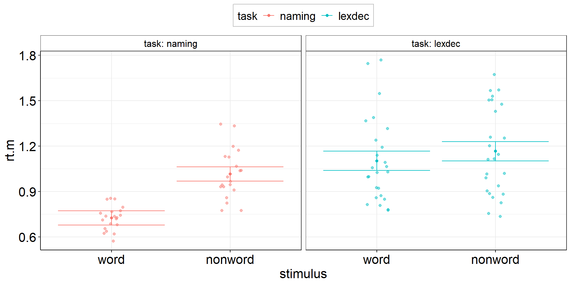
Between-effect modulated by within-variable:
Is the reaction time difference between naming and lexical decision different for words vs. non-words?
aov2 <-
  fhch2010_summary %>%
    pivot_wider(names_from = task, values_from = rt, id_cols = c(id, stimulus)) %>%
    summarize(
      .by = stimulus, # task is implicitly kept due to pivot_wider
      ci.length = confintr::ci_mean_diff(naming, lexdec)$interval %>% diff(), # do this first so we can overwrite naming & lexdec
      # ci.length = t.test(naming, lexdec)$conf.int %>% diff(), # alternative - same results!
      naming = mean(naming, na.rm = TRUE),
      lexdec = mean(lexdec, na.rm = TRUE)
    ) %>%
    pivot_longer(cols = c(naming, lexdec), names_to = "task", values_to = "rt.m") %>%

  ggplot(aes(y = rt.m, x = task, color = stimulus)) +
  facet_wrap(vars(stimulus), labeller = label_both) +
  geom_point(position = position_dodge(.9)) + # explicitly specify default width = .9
  geom_errorbar(aes(ymin = rt.m - ci.length/2, ymax = rt.m + ci.length/2),
                position = position_dodge(.9)) + # explicitly specify default width = .9
  theme(legend.position = "top")
ANOVA interaction: Viz Code 2.2
Between-effect modulated by within-variable:
Is the reaction time difference between naming and lexical decision different for words vs. non-words?
aov2 <-
  fhch2010_summary %>%
  # alternative: spare the first pivot by using base R indexing
  summarize(
    .by = stimulus,
    ci.length = confintr::ci_mean_diff(rt[task == "naming"], rt[task == "lexdec"])$interval %>% diff(),
    naming = mean(rt[task == "naming"]),
    lexdec = mean(rt[task == "lexdec"])
  ) %>%
  pivot_longer(cols = c(naming, lexdec), names_to = "task", values_to = "rt.m") %>%

  ggplot(aes(y = rt.m, x = task, color = stimulus)) +
  facet_wrap(vars(stimulus), labeller = label_both) +
  geom_point(position = position_dodge(.9)) + #explicitly specify default width = .9
  geom_errorbar(aes(ymin = rt.m - ci.length/2, ymax = rt.m + ci.length/2),
                position = position_dodge(.9)) + #explicitly specify default width = .9
  theme(legend.position = "top")
ANOVA interaction: Figures
Within-Errors on Marginal Means
There are methods to draw within-subject errors directly on marginal means instead of on paired differences (e.g., Morey, 2008).
While this is okay for the simplest design including one within-variable with just two factor levels, this already becomes problematic at 3 levels because sphericity may not hold, i.e., the variance may be heterogenous across paired differences (level 1-2 vs. 2-3).
→ If the CI for 1-2 is small but CI for 2-3 is large. What do you plot on factor level 2?
⇒ The within-subjects standard error is a characteristic of paired differences and should thus not be plotted on factor levels.
Correlations
What is the correlation between reactions to words and non-words in the naming task?
We want to include subject-level CIs, so we need to start with the trial-level data!
fhch2010_summary2 <-
  afex::fhch2010 %>% #trial-level data!
  filter(task == "naming") %>%
  summarize(.by = c(id, task, stimulus), #retain task column for future reference
            rt.m = mean(rt),
            rt.m.low = confintr::ci_mean(rt)$interval[[1]], #subject-level CIs!
            rt.m.high = confintr::ci_mean(rt)$interval[[2]]) #subject-level CIs!

correl <-
  with(fhch2010_summary2 %>%
         pivot_wider(names_from = stimulus, values_from = rt.m, id_cols = id),
       cor.test(word, nonword)) %>% apa::cor_apa(r_ci = TRUE, print = FALSE)
correl
[1] "r(18) = .89 [.73; .96], p < .001"Correlations: Viz Code
correlplot <-
  fhch2010_summary2 %>%
  pivot_wider(names_from = stimulus, values_from = starts_with("rt.m")) %>% #also rt.m.low & rt.m.high
  ggplot(aes(x = rt.m_nonword, y = rt.m_word)) + #non-words vs. words
  stat_smooth(method = "lm", se = TRUE) + #linear regression line with confidence bands
  geom_point() + #rt means of individual subjects
  geom_errorbarh(aes(xmin = rt.m.low_nonword, xmax = rt.m.high_nonword)) + #horizontal CIs: non-words
  geom_errorbar (aes(ymin = rt.m.low_word,    ymax = rt.m.high_word)) +    #vertical   CIs: words
  geom_label(aes(x = min(rt.m.low_nonword), y = max(rt.m.high_word)), #statistics to show off
             hjust = "inward",
             label = correl) +
  coord_equal() #same scaling on both axes (even though break tics are different)
Correlations: Figure
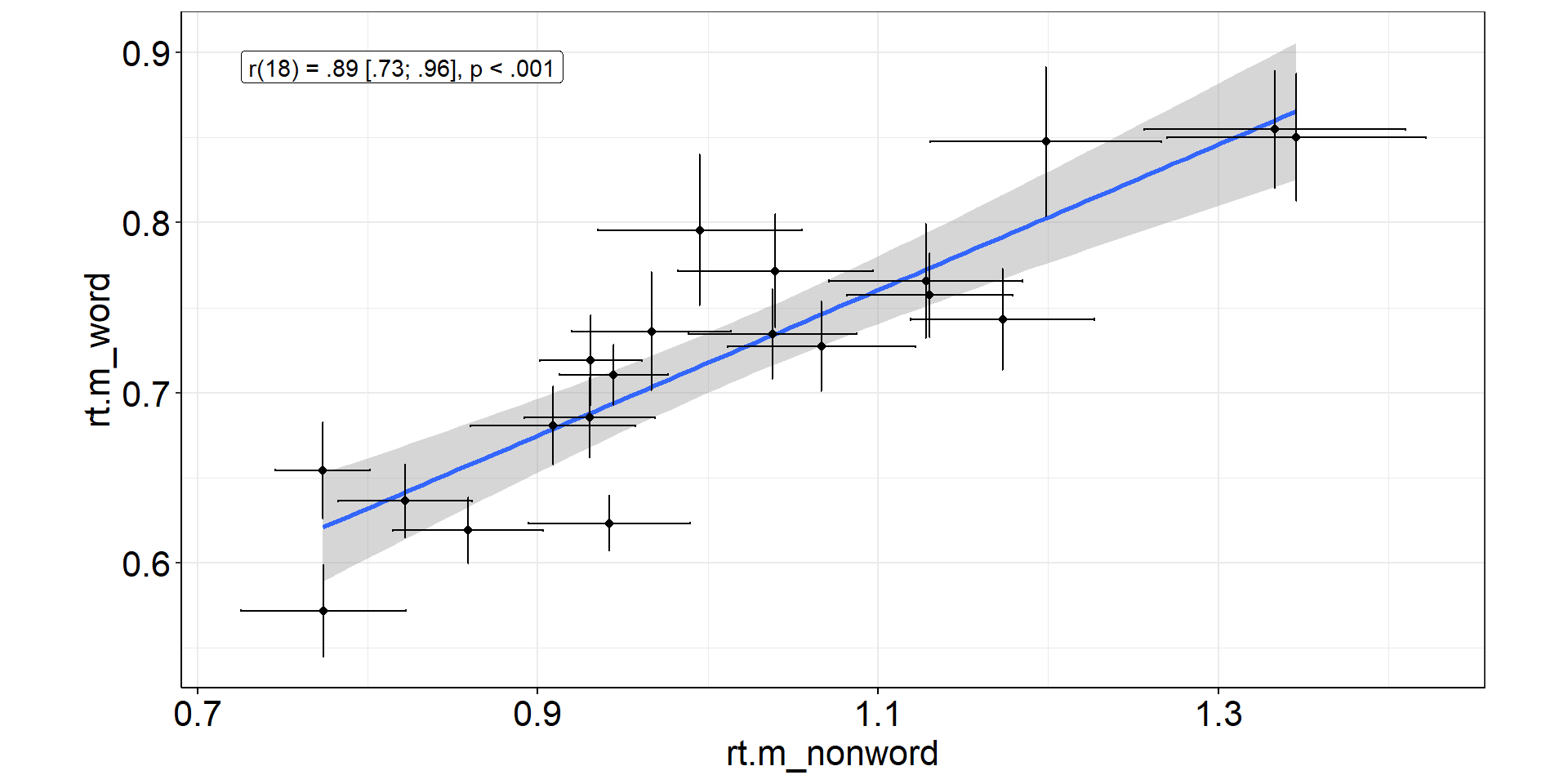
Error bars for non-words are bigger!
⇒ More non-word trials to increase precision and stabilize correlation estimation?
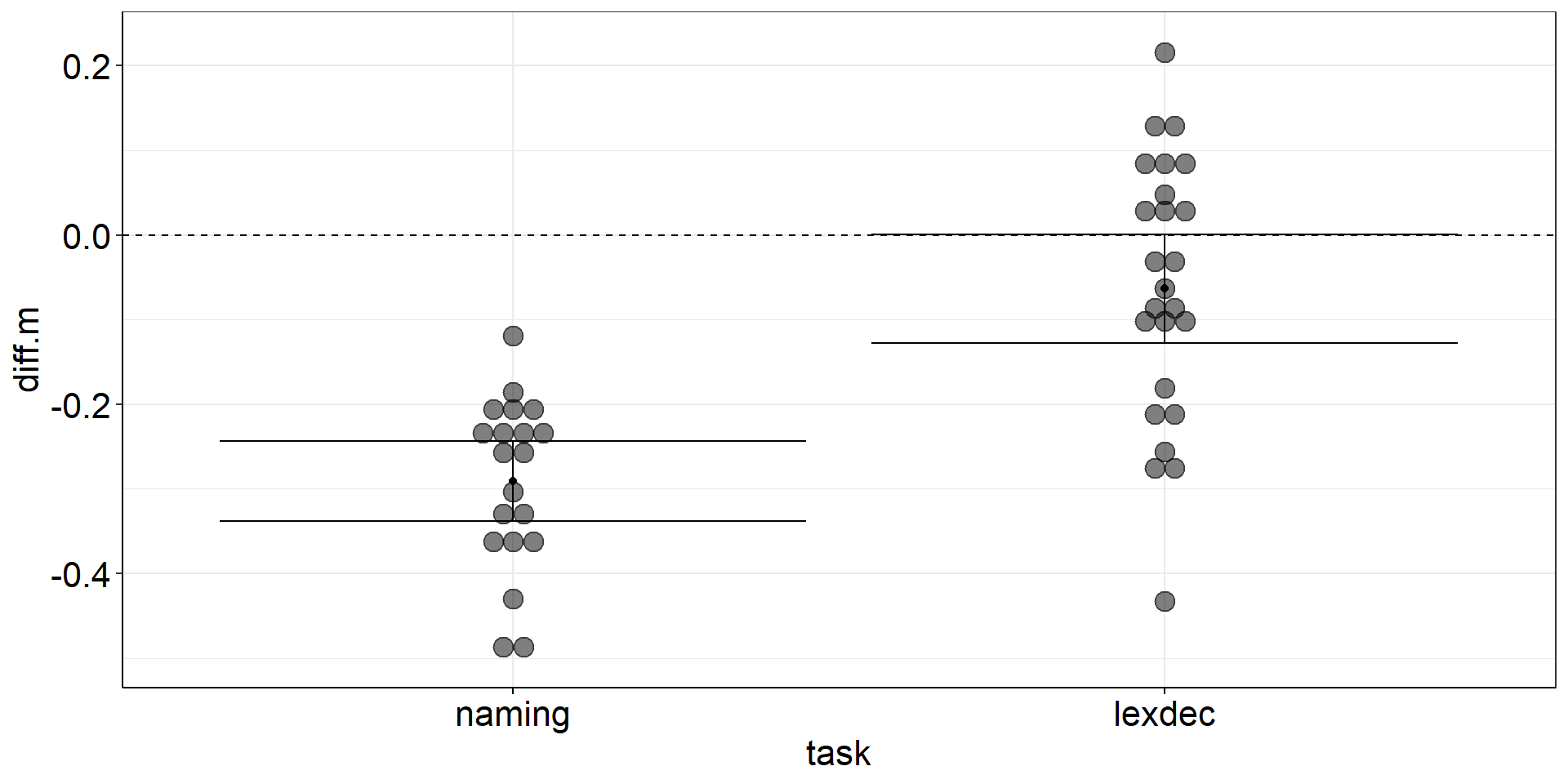
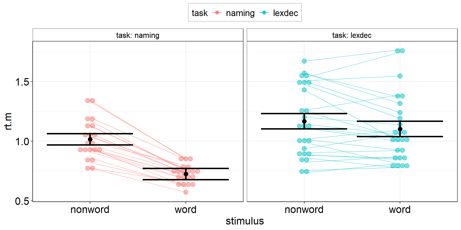
Visualizing “Raw Data”
As we see from the previous scatter plot, it is informative to see individual “raw data” points. Wouldn’t this be nice to have for the group-differences plots (t-tests + ANOVA), too?
With ggplot, we can simply add a new layer on our previous plots aov1 and aov2.
Quick technical note: Usually, we do not visualize the “raw” (trial-level) data but the subject-level aggregates (→ we could always visualize subject-level precision!).
Stacked Points
aov1 +
  geom_dotplot( # experts can try ggbeeswarm::geom_beeswarm()
    data = fhch2010_summary %>% #I should have saved this calculation step...
      pivot_wider(names_from = "stimulus", values_from = "rt", id_cols = c(id, task)) %>%
      mutate(diff.m = word - nonword), #if we call this diff.m, it conforms to aov1
    #aes(y = diff.m, x = task), #inherited from aov1
    binaxis = "y",
    stackdir = "center",
    alpha = .5
  )
Stacked Points
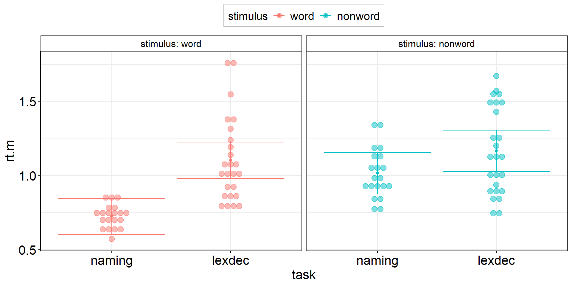
Stacked Points 2
aov2 +
  geom_dotplot( # experts can try ggbeeswarm::geom_beeswarm()
    data = fhch2010_summary %>% rename(rt.m = rt), #conform to naming in aov2
    #aes(y = rt.m, x = task), #inherited from aov2
    aes(fill = stimulus), #dotplot dots have color = outer border, fill = inner color
    binaxis = "y",
    stackdir = "center",
    alpha = .5
  )
Stacked Points 2
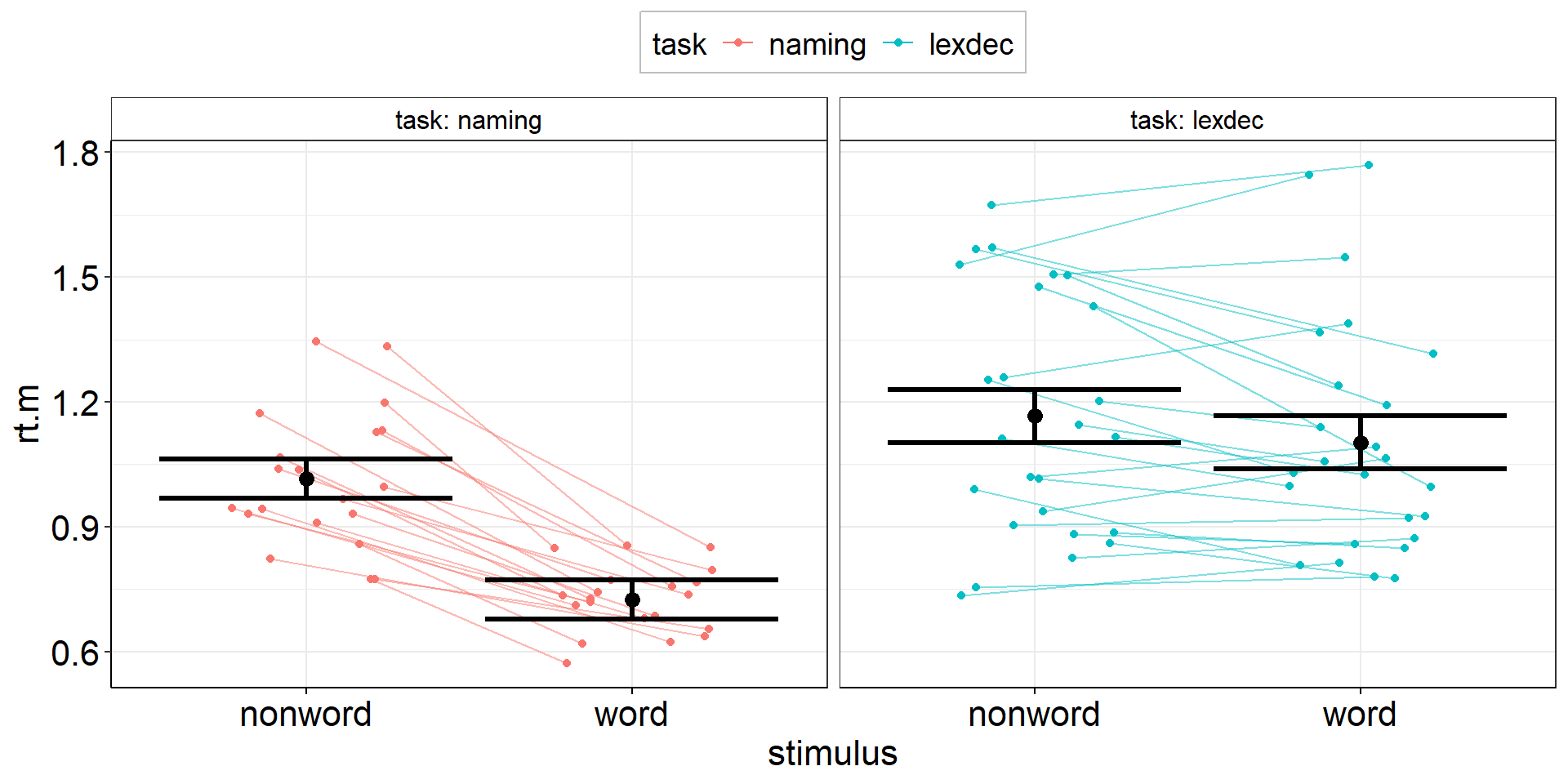
Stacked Points 3
Now that we have added individual points, can we also add individual slopes to show the variability in within-subject changes between words and nonwords?
aov3 <-
  fhch2010_summary %>%
  pivot_wider(names_from = stimulus, values_from = rt, id_cols = c(id, task)) %>%
  summarize(
    .by = task, # stimulus is implicitly kept due to pivot_wider
    ci.length = confintr::ci_mean(word - nonword)$interval %>% diff(), # do this first so we can overwrite word & nonword
    # ci.length = t.test(word, nonword, paired = TRUE)$conf.int[1:2] %>% diff(), # alternative - same result!
    word = mean(word, na.rm = TRUE),
    nonword = mean(nonword, na.rm = TRUE)
  ) %>%
  pivot_longer(cols = c(word, nonword), names_to = "stimulus", values_to = "rt.m") %>%

  ggplot(aes(y = rt.m, x = stimulus, color = task)) + # task and stimulus switched compared to aov2
  facet_wrap(vars(task), labeller = label_both) + # task and stimulus switched compared to aov2
  geom_point(position = position_dodge(.9)) + # explicitly specify default width = .9
  geom_errorbar(aes(ymin = rt.m - ci.length/2, ymax = rt.m + ci.length/2),
                position = position_dodge(.9)) + # explicitly specify default width = .9
  myGgTheme +
  theme(legend.position = "top")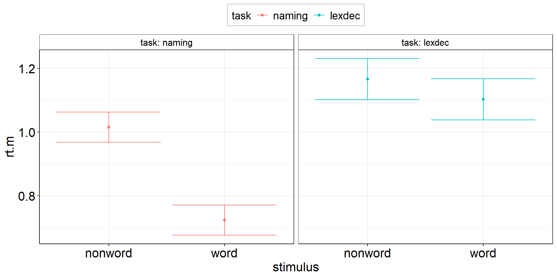
Stacked Points 3
Stacked Points 3
aov3 +
  geom_dotplot( # experts can try ggbeeswarm::geom_beeswarm()
    data = fhch2010_summary %>% rename(rt.m = rt), #conform to naming in aov3
    #aes(y = rt.m, x = stimulus), #inherited from aov3
    aes(fill = task), #dotplot dots have color = outer border, fill = inner color
    binaxis = "y",
    stackdir = "center",
    alpha = .5
  ) +
  geom_line( #add individual slopes
    data = fhch2010_summary %>% rename(rt.m = rt), #conform to naming in aov3
    aes(group = id), #one line for each subject; sometimes you need: group = interaction(id, task)
    alpha = .5) +
  #plot group-level information again (on top) but black and bigger
  geom_point(position = position_dodge(.9), color = "black", size = 3) +
  geom_errorbar(aes(ymin = rt.m - ci.length/2, ymax = rt.m + ci.length/2),
                position = position_dodge(.9),
color = "black", linewidth = 1.125)Stacked Points 3
Jittered Points
Jittered Points
Jittered Points with Individual Slopes
Only geom_path() is able to align points + lines! geom_line() will not work here. (Ordering can be important: geom_path() connects the observations in the order in which they appear in the data.)
aov3 +
  geom_jitter(
    data = fhch2010_summary %>% rename(rt.m = rt),
    position = position_jitter(width = .25, height = 0, seed = 1337), #same seed needed!
  ) +
  geom_path( #add individual slopes
    data = fhch2010_summary %>% rename(rt.m = rt),
    aes(group = id),
    position = position_jitter(width = .25, height = 0, seed = 1337), #same seed needed!
    alpha = .5) +
  #plot group-level information again (on top) but black and bigger
  geom_point(position = position_dodge(.9), color = "black", size = 3) +
  geom_errorbar(aes(ymin = rt.m - ci.length/2, ymax = rt.m + ci.length/2), position = position_dodge(.9),
                color = "black", linewidth = 1.125)
Jittered Points with Individual Slopes
Density
aov3 +
  geom_violin(
    data = fhch2010_summary %>% rename(rt.m = rt), #conform to naming in aov3
    #aes(y = rt.m, x = stimulus), #inherited from aov3
    aes(fill = task), #dotplot dots have color = outer border, fill = inner color
    alpha = .5
  ) +
  geom_line( #add individual slopes
    data = fhch2010_summary %>% rename(rt.m = rt), #conform to naming in aov3
    aes(group = id), #one line for each subject; sometimes you need: group = interaction(id, task)
    alpha = .5) +
  #plot group-level information again (on top) but black and bigger
  geom_point(position = position_dodge(.9), color = "black", size = 3) +
  geom_errorbar(aes(ymin = rt.m - ci.length/2, ymax = rt.m + ci.length/2), position = position_dodge(.9),
                color = "black", linewidth = 1.125)
Density
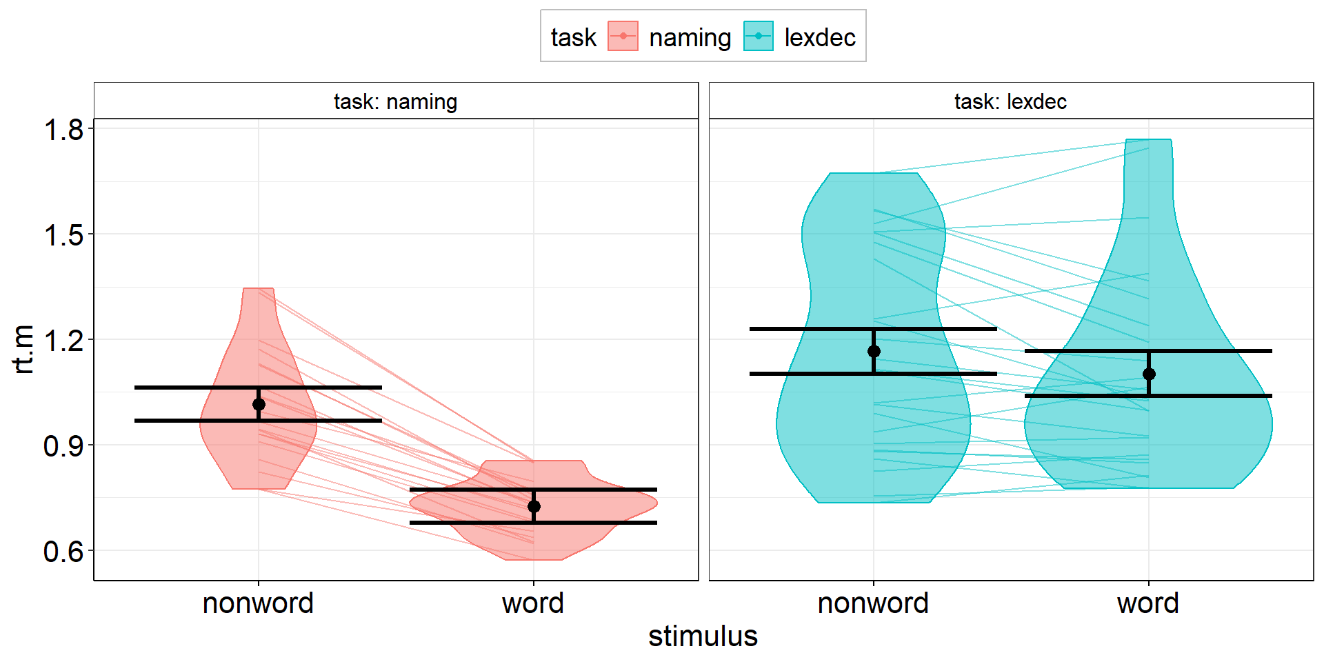
Tough Decisions
What looks most insightful (or most pleasing) depends heavily on your sample size (and your personal preference).
Usually, the plots shown here work best with sample size in ascending order:
dot plotfor small samplesjittered pointsfor medium samplesviolin plotfor large samples
Everything Everywhere All at Once
If you are prone to decision paralysis, try a mixture of jittered points and violin plot:
the Raincloud Plot (Allen et al., 2019)
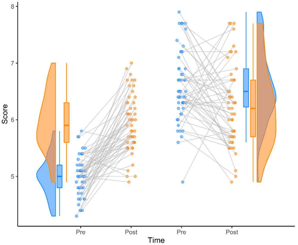
Thanks for Your Attention!
Learning objectives:
- Know how to plot subject-level averages with group-level aggregates and CIs
- Be aware of the difference between the variance components between and within subjects.
This is the end of our workshop on “Handling Uncertainty in your Data”!
We hope you found it useful and/or inspiring!
Please fill out the evaluation! (link will be shared in Zoom)